Installing a Helm Chart
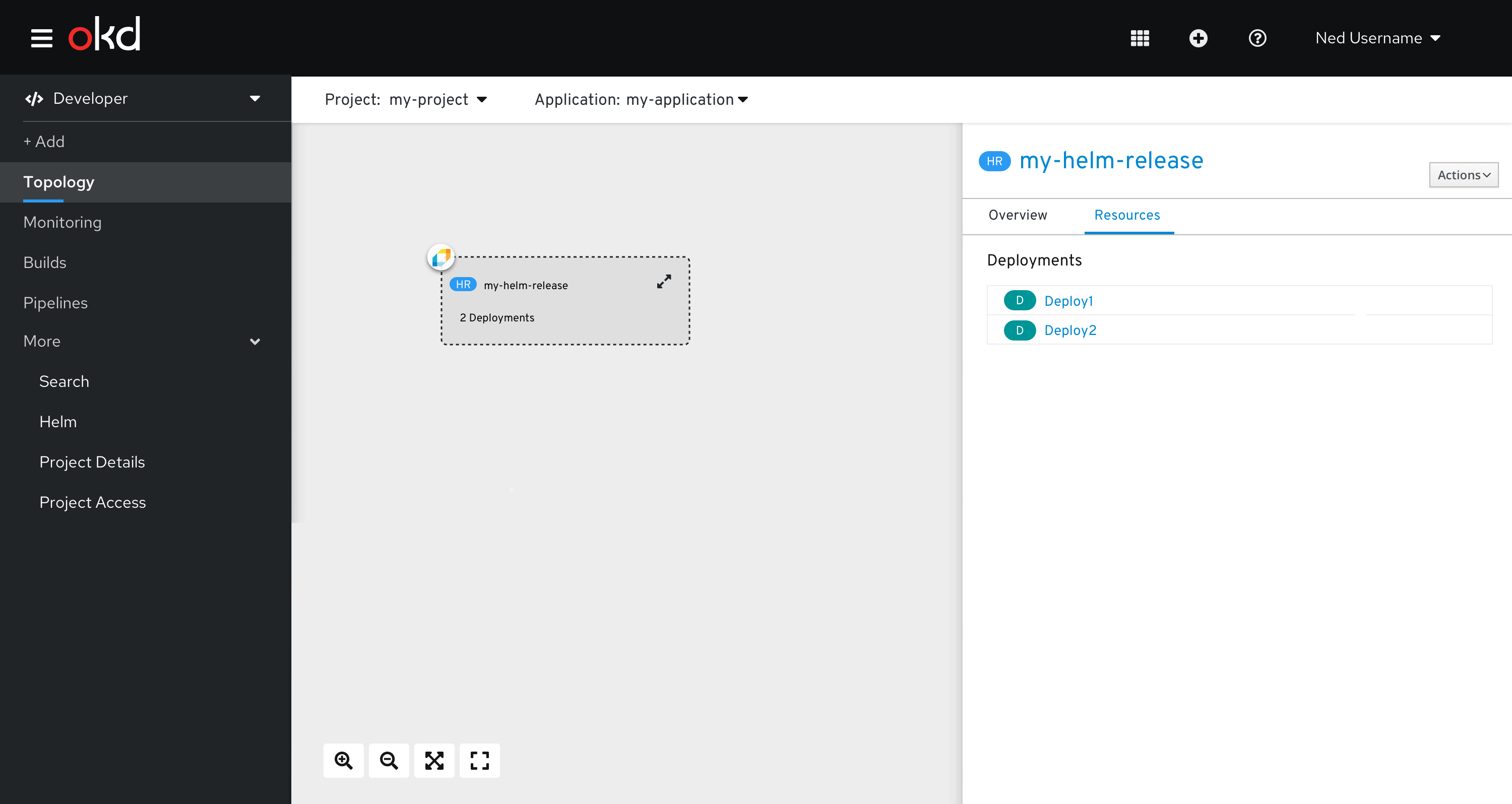
Upon selecting a helm chart in the catalog, the side panel will display relevant information about the helm chart. The specific data to be shown will be determined during the detailed design UX story
Here are a few examples of what current info panels look like:
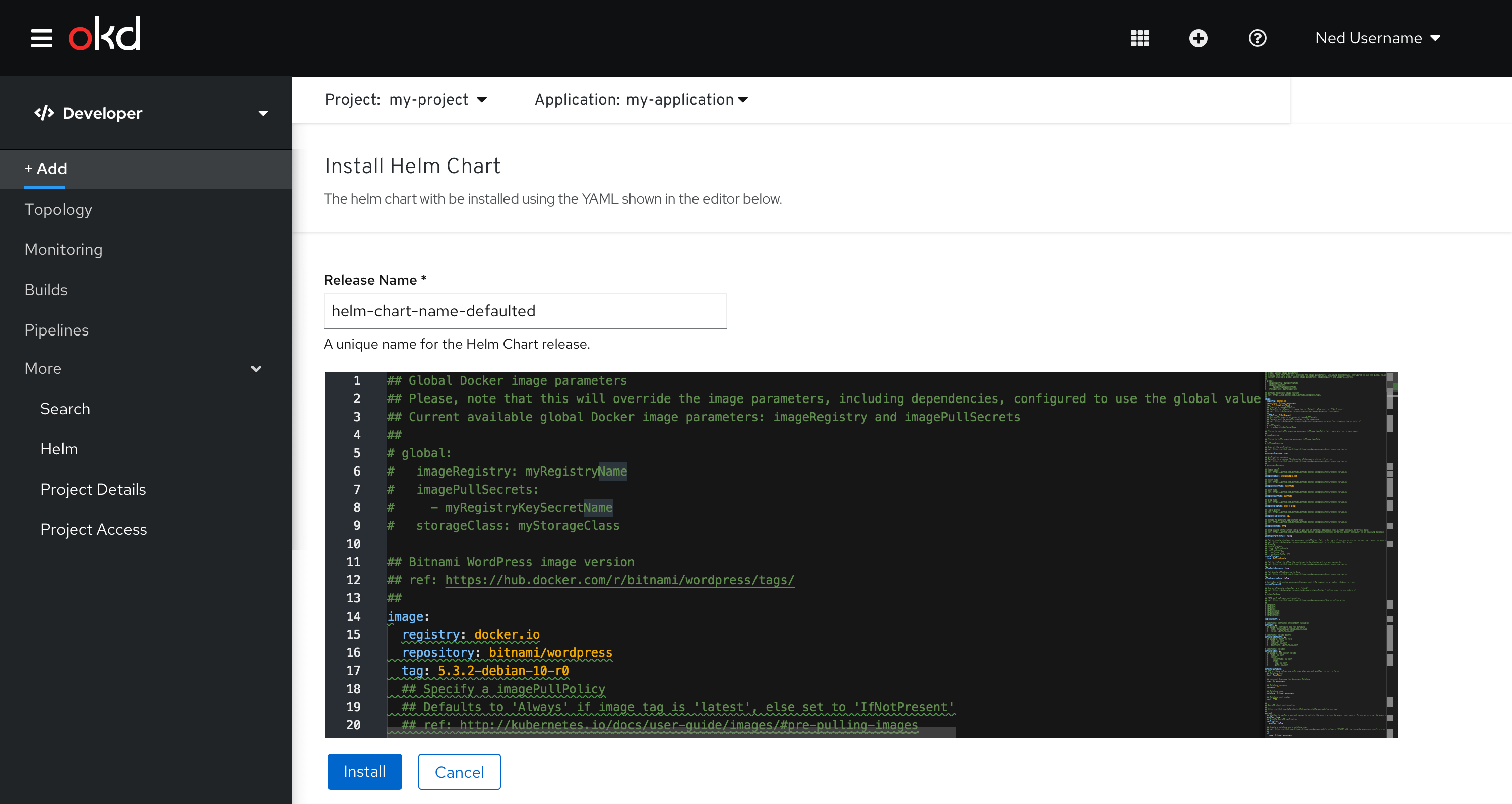
- Clicking install should bring the user to Install Helm Chart page, including a text field for the Release Name and a YAML editor.
- A default release name will be generated based on the selected helm chart
- The YAML editor is pre-loaded with the YAML associated with the selected helm chart.
- The user can optionally update the YAML
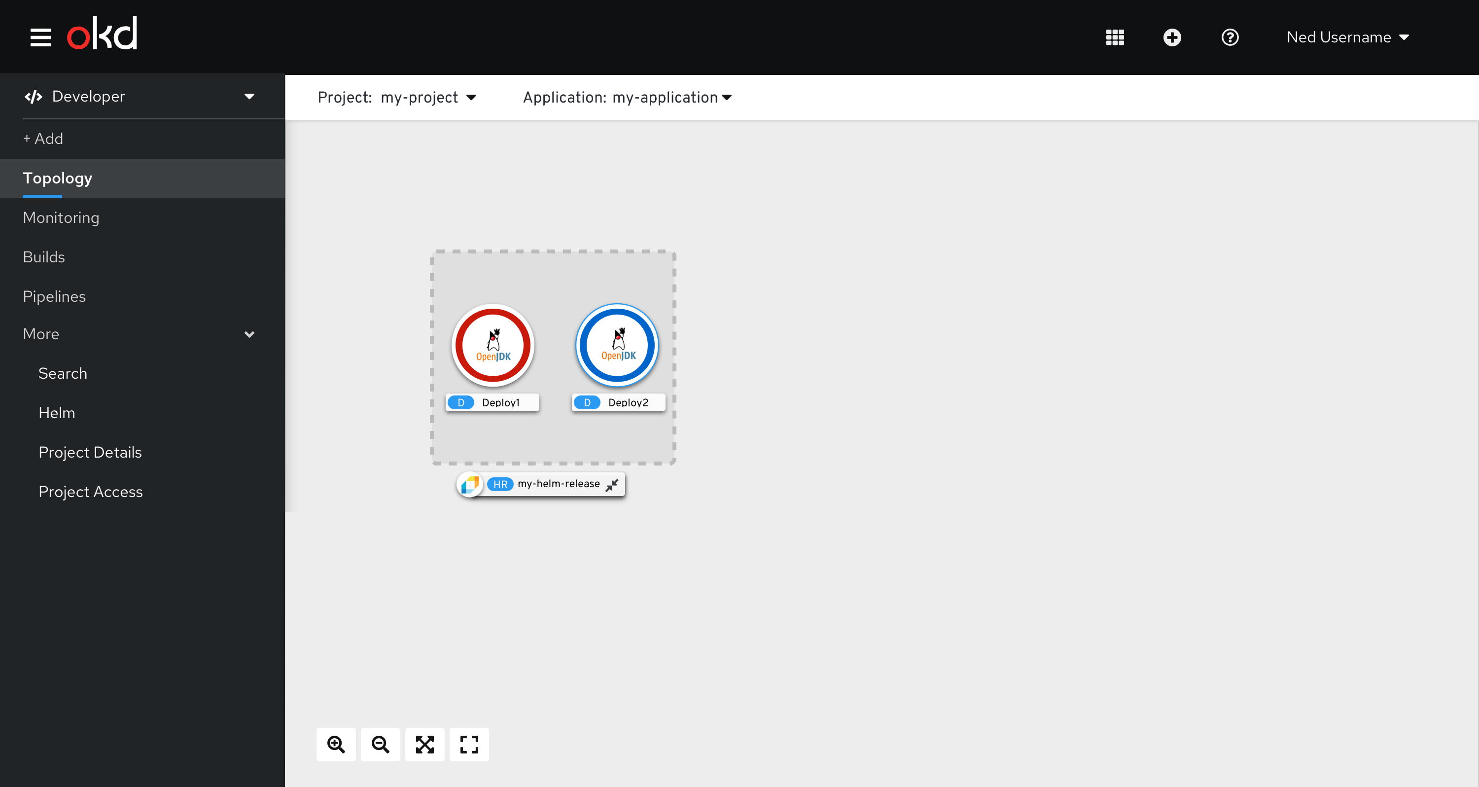
Once the Helm Chart is created, the user will be brought to the Topology view.
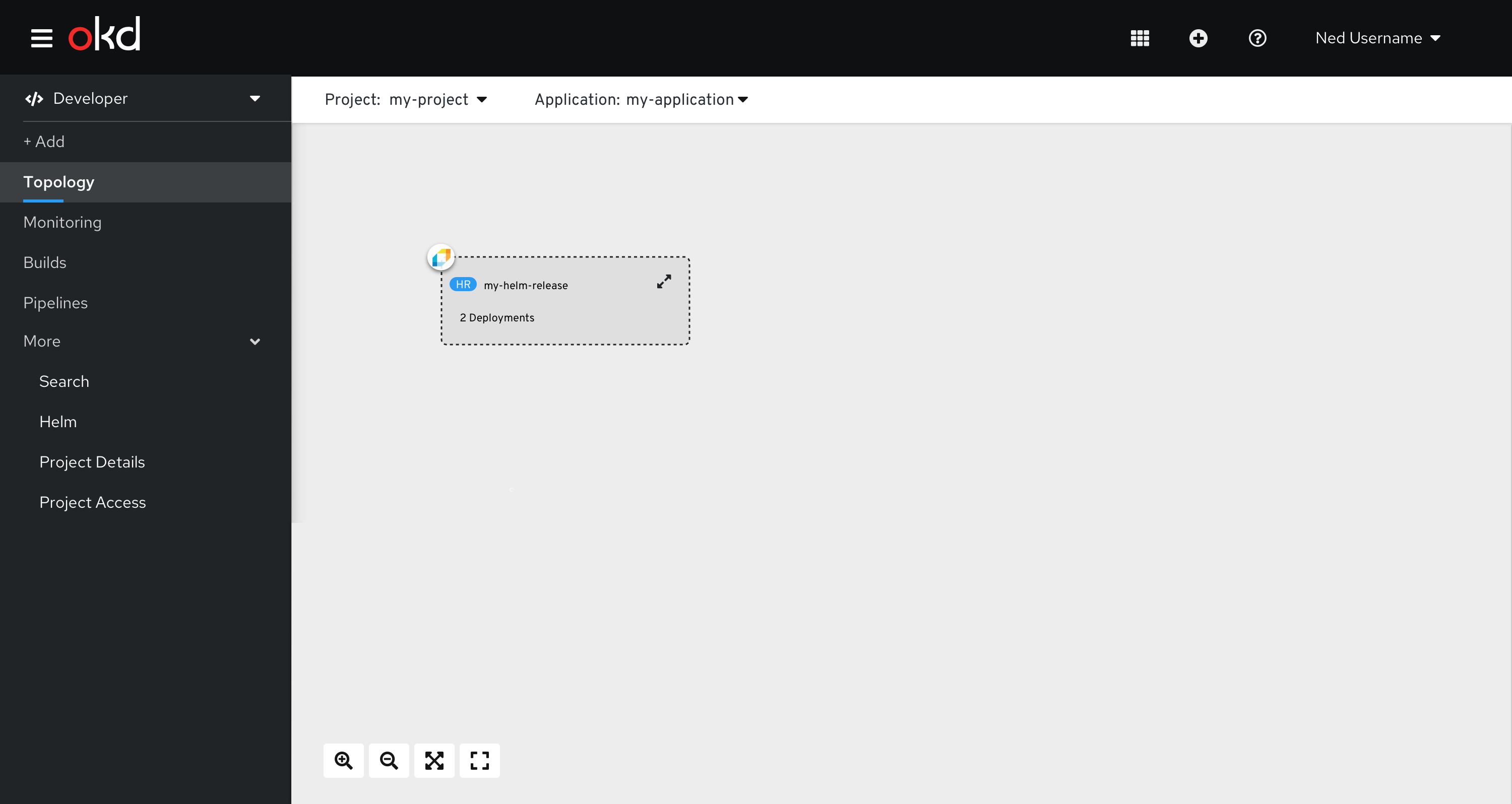
Helm Releases in Topology
- Helm releases need to be represented as a group in the Topology & associated list view
- The user will be prevented from moving items in or out of the “helm release grouping”
- Visually, this grouping needs to be different than an application grouping, since the behavior will be different
- Helm releases should be able to be collapsed/expanded
- An expanded helm release grouping should show the following
- Resource badge & name
- Icon of the associated helm chart
- If there is no icon available, use the default Helm icon
- https://github.com/cncf/artwork/blob/master/projects/helm/horizontal/black/helm-horizontal-black.png
- https://github.com/cncf/artwork/blob/master/projects/helm/horizontal/black/helm-horizontal-black.svg
- High level resources are displayed within the helm release group
- Note: the expanded grouping will be consistent with expanded groupings in topology
- If there is no icon available, use the default Helm icon
- A collapsed helm release grouping should show the following
- Resource badge & name
- Icon of the associated helm chart
- Total number of high level resources along with a status summary
- Note: the collapsed grouping will be consistent with collapsed groupings in topology