Ordering Experience
The catalog will include builder images, templates and items from the Broker API. This experience allows the user to remain in context, by using the overlay panel.
Design
- Upon clicking on an item in the catalog, the Overlay Panel Component will be used to generate a guided experience.
- The guided overlay panel has 3 main areas: top panel, content panel & button panel
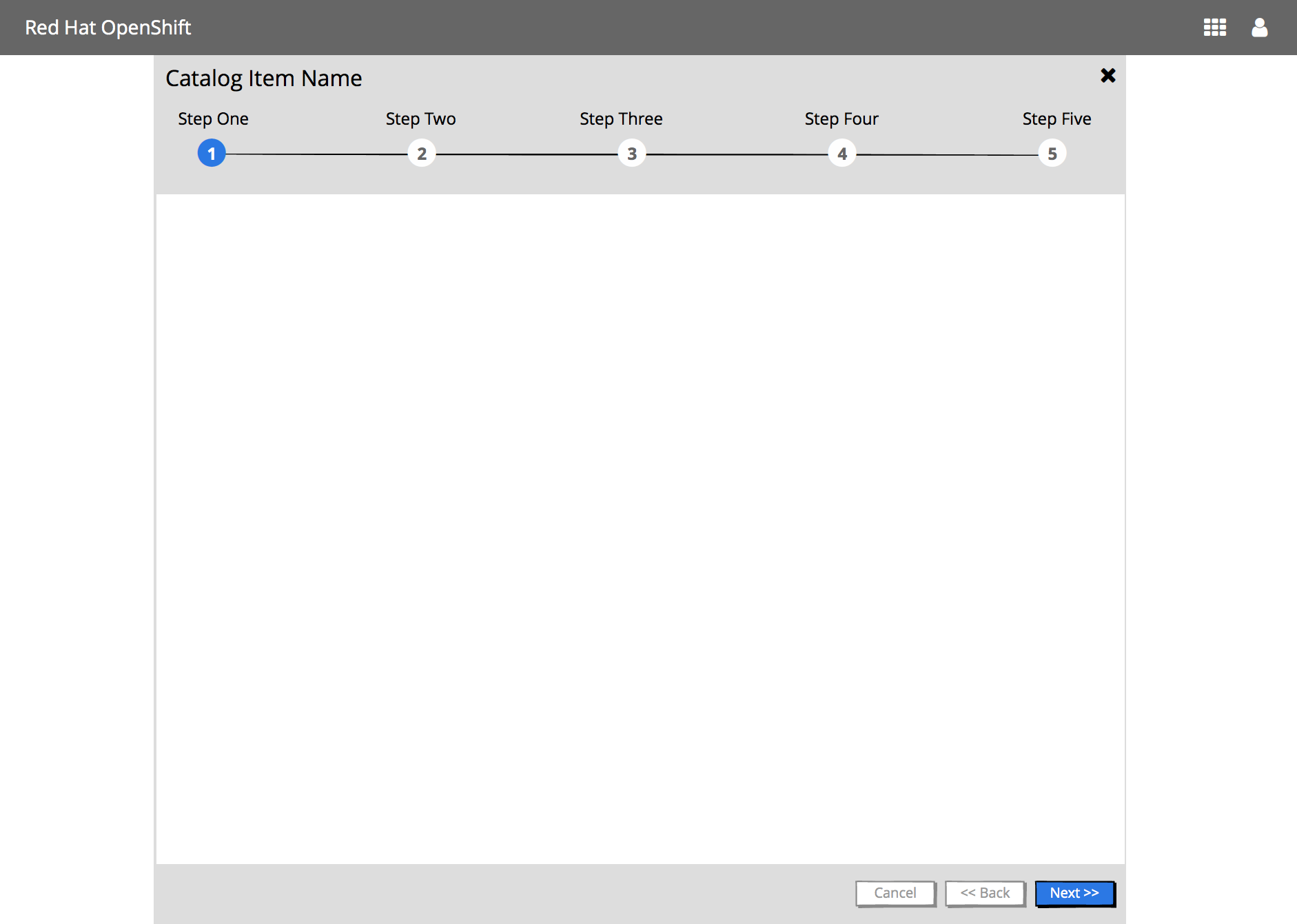
Top Panel
- The Catalog Item Name is displayed as the title of the overlay panel
- The main steps of the wizard are shown under the title
- This panel “sticky”, thus if the content panel scrolls, the top panel will not
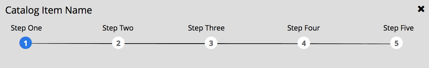
Steps Visualization when there are 5 or less steps
- All step numbers and associated step names are shown
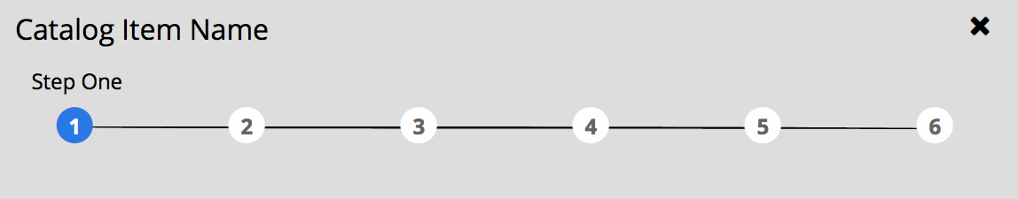
Steps Visualization when there are 6 plus steps
- All step numbers are shown
- Only the current step name is shown
Steps Visualization - Mobile :iphone:
- Only the current step number & name are shown

Content Panel
The content panel displays the content of the steps. This panel displays a vertical scroll as needed.
Button Panel

The button panel includes navigation buttons: Cancel, Back and Next/Create/Close.
- The Back button should always be enabled except for the first step.
- The Next button should become enabled once all required information has been entered for the current step and/or sub-step. The Next button will move the user through any sub-steps before it moves the user to the next main step. The Back button will also behave the same way.
Possible Steps
The following steps may be part of the this process:
- Information
- Plan (optional)
- Configuration
- Bind (optional)
- Parameters (optional)
- Results
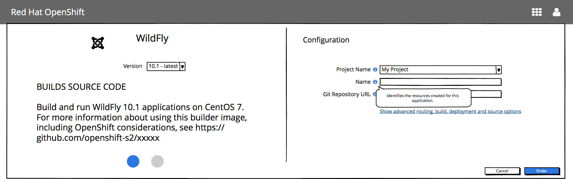
1 - Information Step
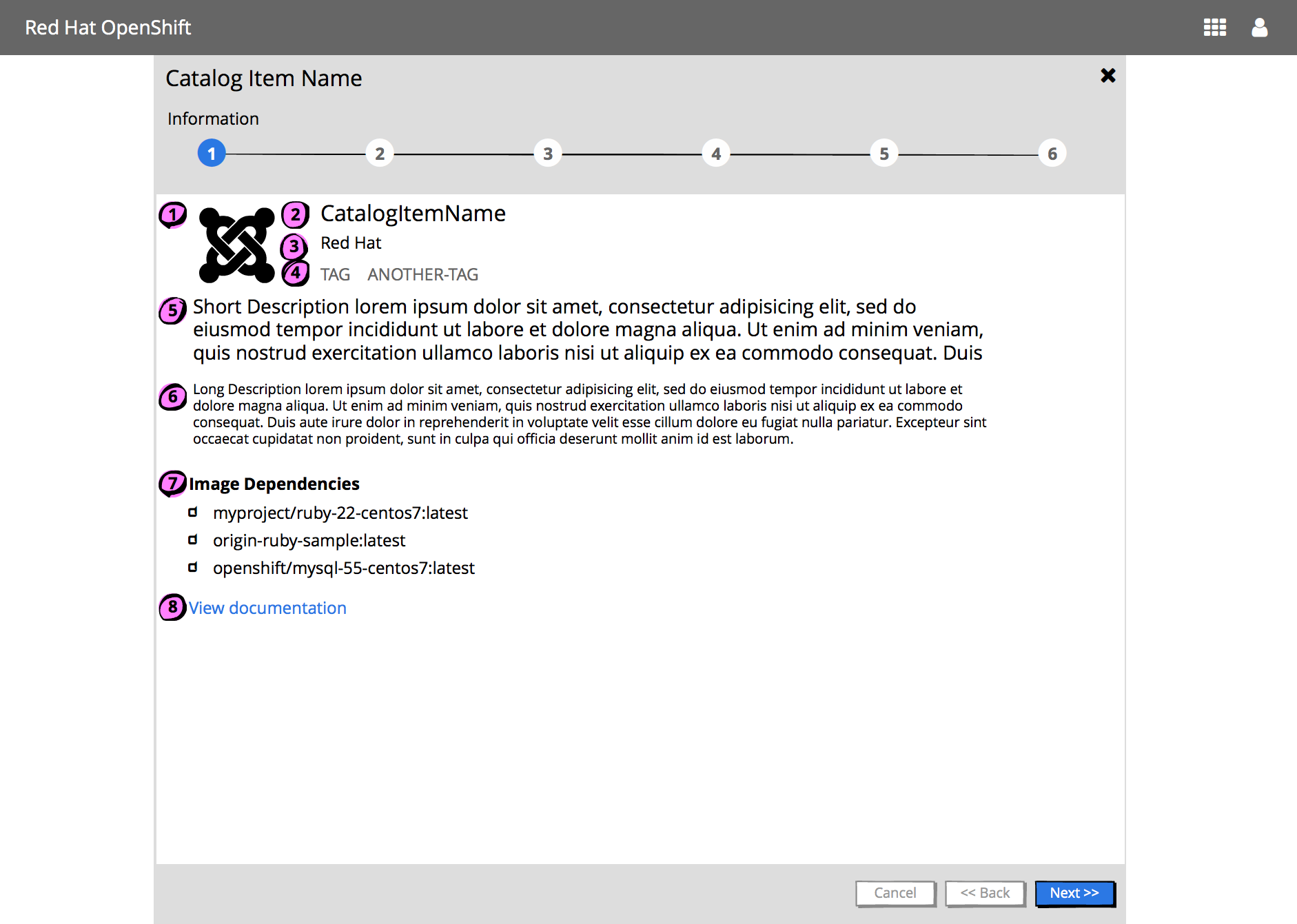
- Catalog Item Icon
- metadata.imageURL from OpenServiceBroker Service Metadata
- Catalog Item Name
- metadata.displayName from OpenServiceBroker Service Metadata
- Provider (Optional)
- metadata.providerDisplayName from OpenServiceBroker Service Metadata
- List of tags (Optional)
- Short description (Optional)
- Long description (Optional)
- metadata.longDescription from OpenServiceBroker Service Metadata
- Image dependencies : Includes an Image Dependencies title following by a list of dependencies. Each image name is preceded by an image icon (note the PF icon)
- View documentation link which will open a new browser/tab linking to the Documentation URL (Optional)
- metadata.documentationUrl from OpenServiceBroker Service Metadata
2 - Plan Step (Optional)
This step should be shown if there are 1+ plans.
Single Plan
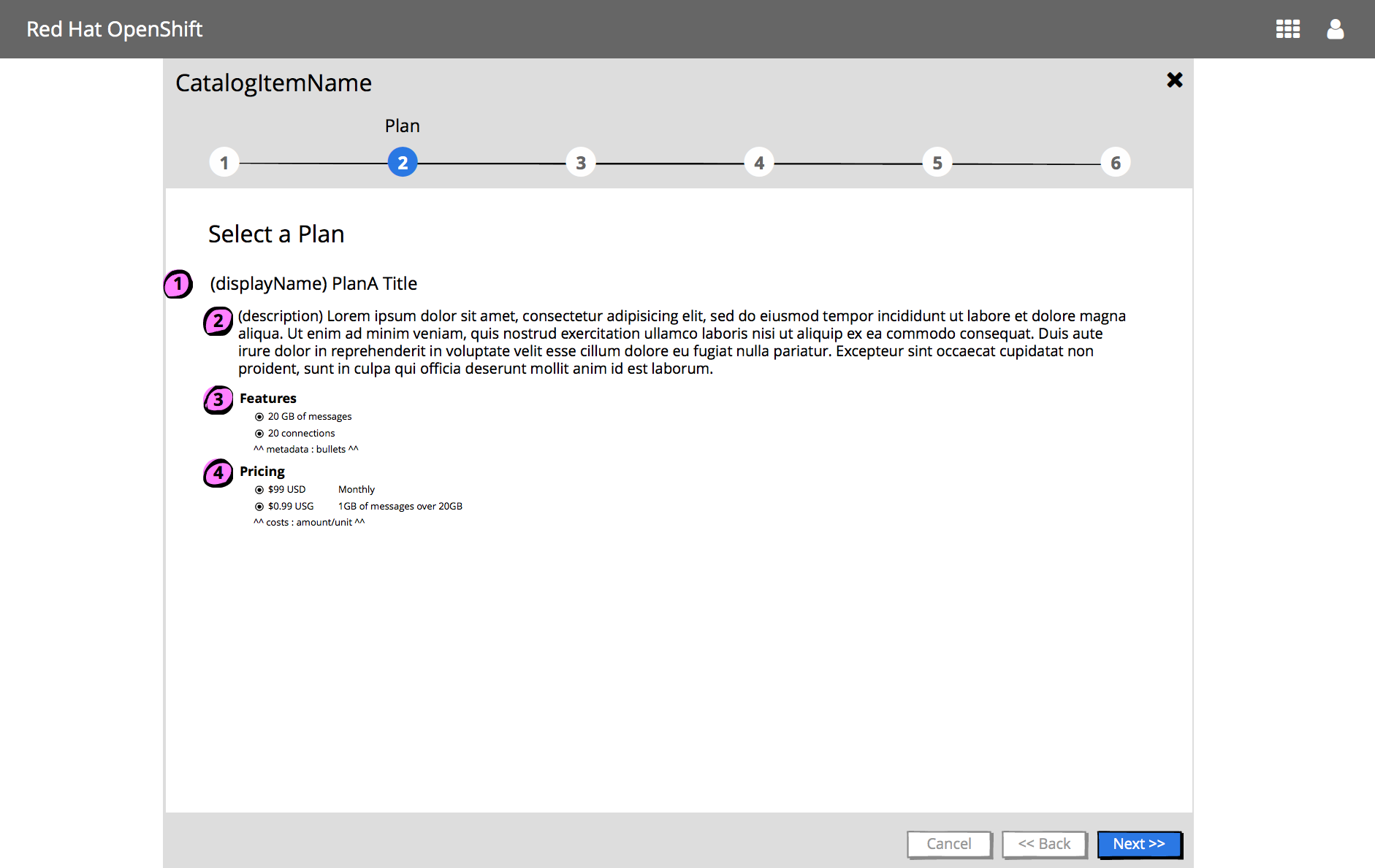
For each plan, display:
- Plan title
- metadata.displayName from Plan Metadata Fields
- Optional description
- Features
- if the plan has 1+ features, show a Features title following by a list of features
- metadata.bullets from Plan Metadata Fields
- Pricing
- if the plan has 1+ pricing options, show a Pricing title following by a list of costs
- amount from Cost Object of the Plan Metadata Fields
- unit from Cost Object of the Plan Metadata Fields
- Buttons associated with this step
- Cancel, Back & Next buttons should be displayed & enabled
Multiple Plans
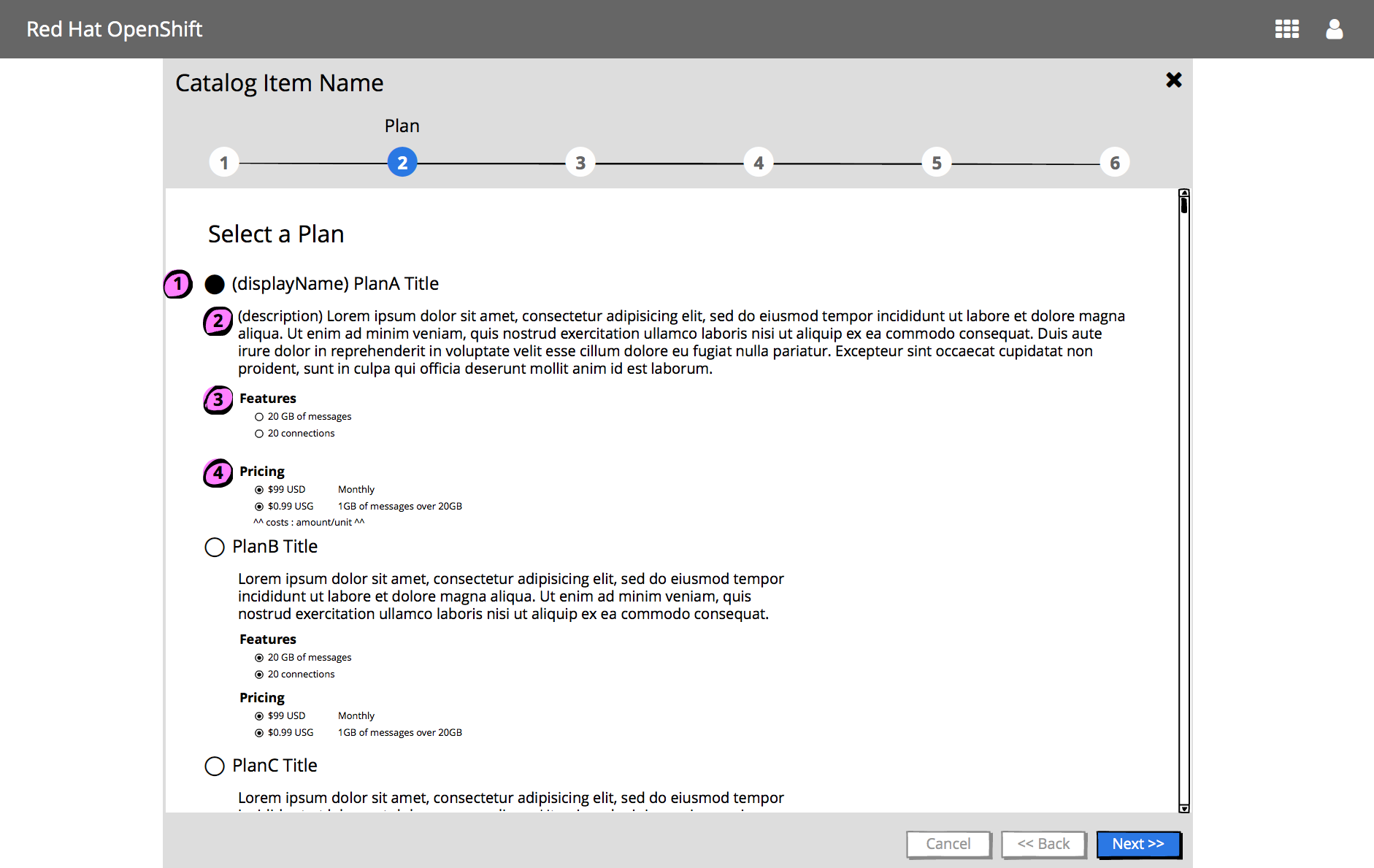
- Each plan should be presented as a radio button option, by the plan title.
- The first plan should be selected by default.
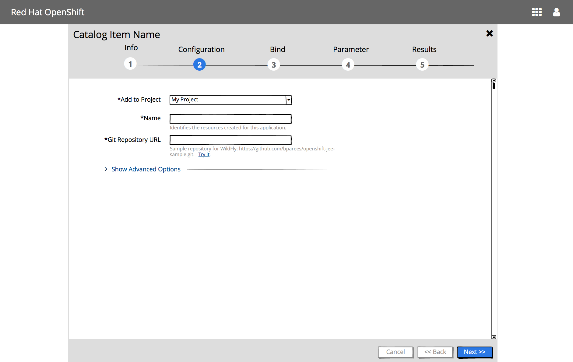
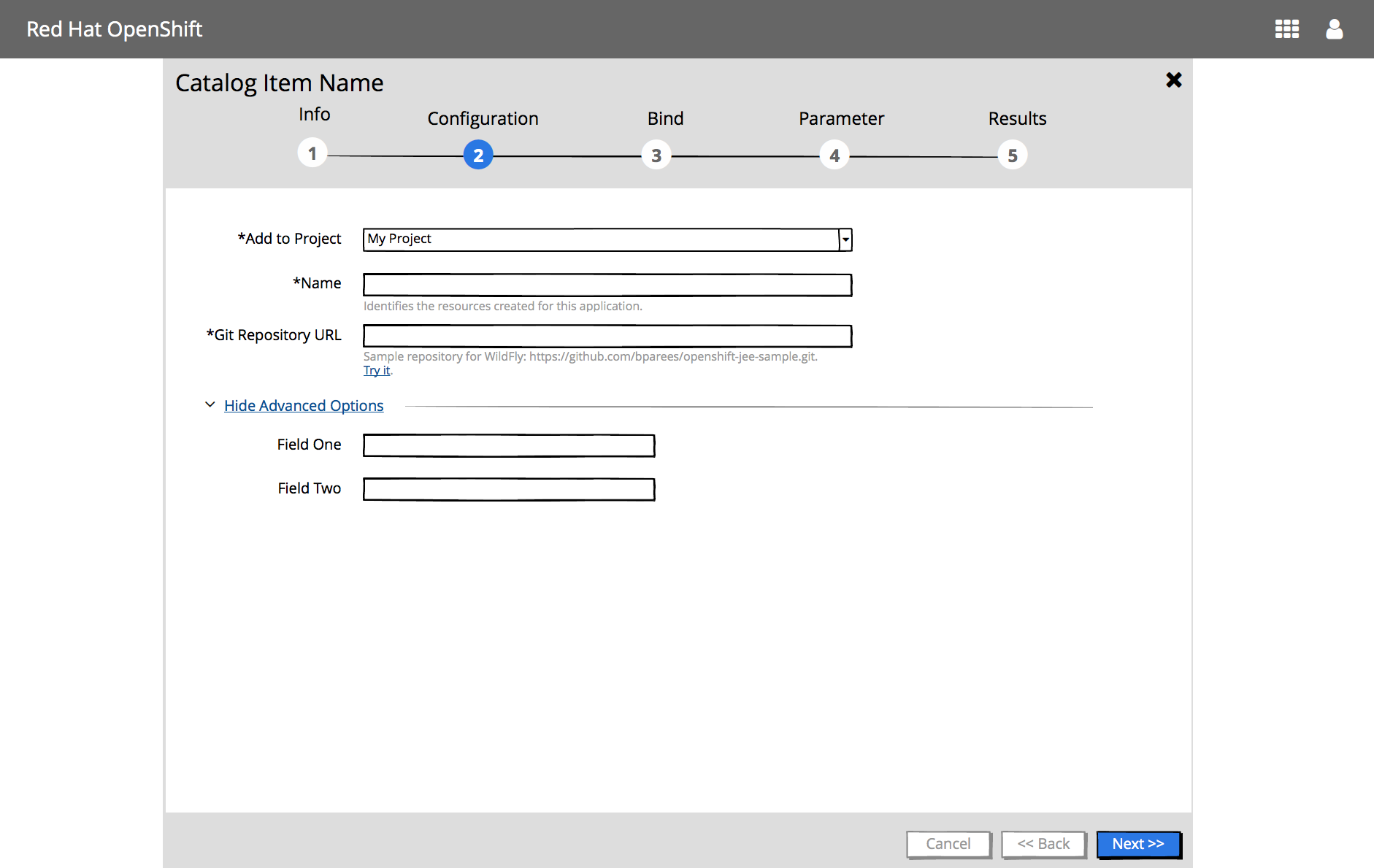
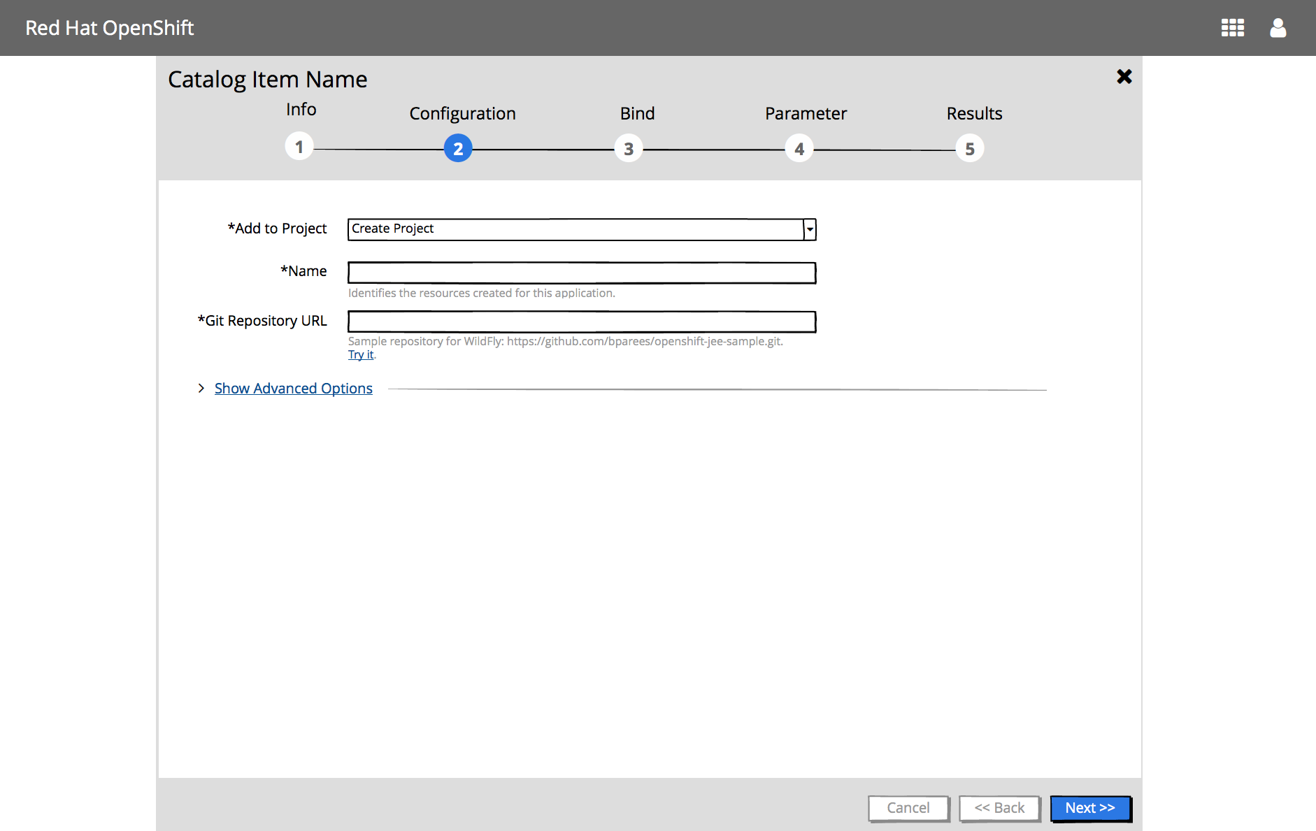
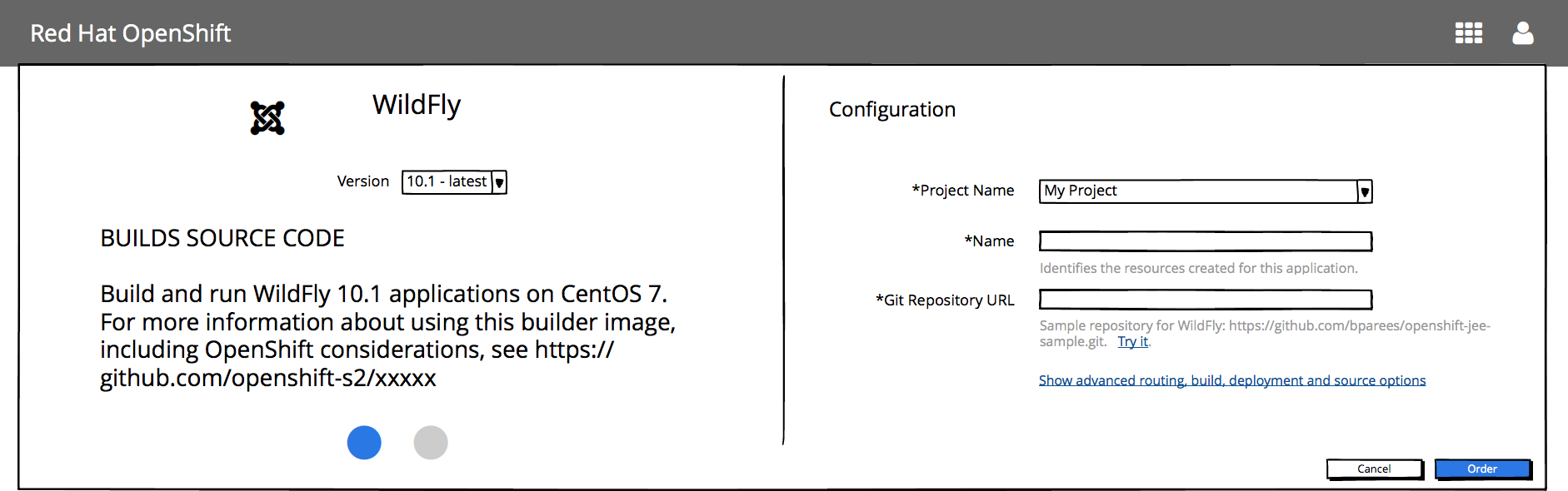
3 - Configuration Step
Implementation Details
- This step is mandatory
- Content panel includes:
- Optional version selection
- Include a Version list if there are multiple versions
- “Add to Project” selection
- “Add to Project” list includes the existing projects the user has access to
- “Create Project”
- “Create Project” should be added to the top of the list, unless it has been turned off on prem
- Clicking “Create Project” will add additional input widgets to gather necessary information to create the project in context
- Configuration options
- Field level validation
- Should be available for builder images
- Will not be supported for items from the catalog API
- Mandatory fields should be indicated with an asterisk
- Field level validation
- Optional “Show Advanced Options” link
- Available for some builder images
- Vertical scroll bar is displayed as needed
- Optional version selection
- Buttons associated with this step
- Cancel, Back & Create buttons should be displayed
- Cancel should always be enabled
- Back should be enabled IF there is a previous Plan step
- Create should be disabled until all mandatory fields have been input
Form Layout
- Labels are displayed before the input widget
Form Layout - Mobile :iphone:
-
On mobile displays, labels are displayed above the input widgets

Catalog item shows advanced options
User views available projects in context of this flow
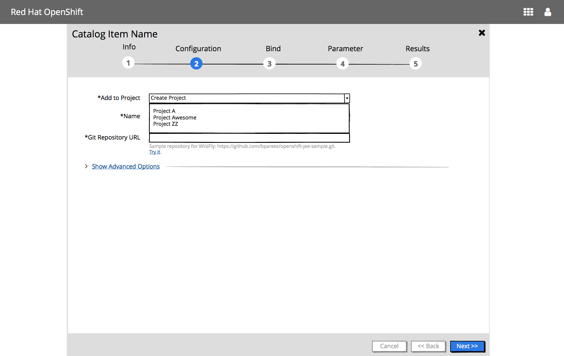
User creates a new project in context of this flow
4 - Bind Step (Optional)
This step is only valid if the selected project is not new / has items that can be bound to. Automatically show this step if the service/image is bindable.
5 - Parameters Step (Optional & Future)
6 - Results Step
See Wizard Results documentation
Expanded Log Section
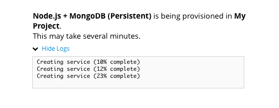
Request has been submitted, and is in progress
** Missing mock **
User views build logs
** Missing mock **
Completed with errors
** Missing mock **
Completed successfully
** Missing mock **
Implementation Details
- This step is mandatory
- Content panel includes:
- Results In Progress or Completed
- Link to View build logs
- If completed, include View Project action
- Buttons associated with this step
- Cancel, Back & Create buttons should be displayed
- Cancel should always be enabled
- Back should be enabled IF there is a previous Plan step
- Create should be enabled IF all mandatory fields have been input
Future Considerations
Review Panel
Should we have a Review panel which then has the action button and then the content will turn to the Results & Create turns to Close?
Field Level Help versus Field Hints
- For now, we will leave the same as currently implemented (field hints)
- Question as to whether we go with Option A (less cluttered & cleaner) or Option B (user sees field level hints up front).
OptionA
- Upside: Less cluttered, cleaner.
- Downside: More work for the user if they need to get help on multiple fields
OptionB
- Upside: User sees field level hints upfront
- Downside: More cluttered, distracting. We (UX) doesn’t control this help information, it’ll be returned from the API so hard to control what is here.