Navigation
Primary Masthead
On the landing page, the only navigation available is the Primary Masthead.
Secondary Masthead
Once a user navigates to a specific project inside the console, a second horizontal bar will appear below the Primary Masthead.
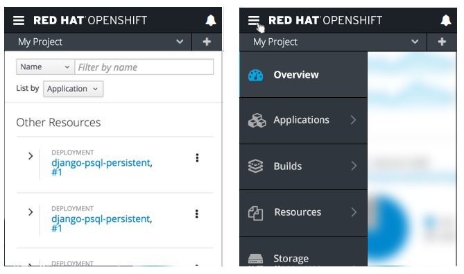
Vertical Navigation
- Below the two horizontal bars, a vertical navigation will display the primary menu options.
- The active page will be indicated visually by highlighting that primary navigation item.
- Colors are defined below:
- Background Color Default: pf-black-900, #292e34
- Background Color Hover/Selected State: #383f47
- Vertical Nav Icons Default: pf-black-600, #72767b
- Vertical Nav Icons Selected State: pf-blue-300, #39a5dc
- Note: The Vertical Navigation should be persistent throughout the console, including when users are on edit screens.
- At this level, the hamburger menu remains shown so that the user can toggle the primary navigation to become just icons to get more horizontal real estate.
- Clicking the hamburger icon again would bring the navigation back to full size.
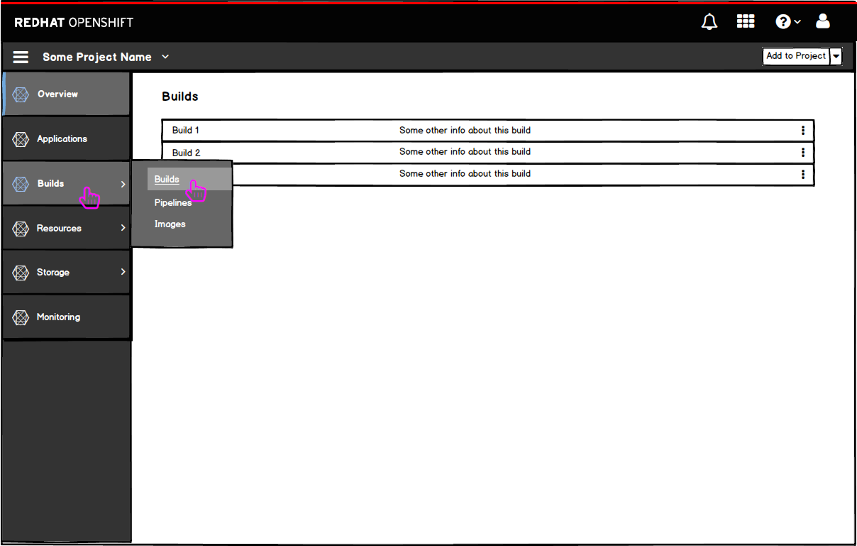
- If the user wants to navigate to the builds section, they can hover or click on the primary nav item to expose the secondary navigation.
- The hover state (Builds) is similar to the selected state (Overview) aside from the blue line on the far left side of the item.
- The navigation menus will follow the new “secondary navigation with flyout” pattern added to PatternFly.
Responsive States
Landing Page
- On smaller viewports, the icons shown from left to right in the masthead should be placed in the hamburger menu from top to bottom with the exception of the notification drawer.
- The bell icon will remain in the top right corner of the masthead for easy access to the notification drawer.
- The drawer should follow PatternFly standards for the responsive behavior as detailed in the Notification Drawer pattern.
- The labels are as follows: (with icons to the left of the labels)
- Launcher
- Help
- [username]
- Logout (no icon)
- Note: the logout option is duplicated below the user menu for easier access, but it still remains part of the user menu as well.
- Note: “Launcher” is a configurable label.
- For secondary and tertiary levels of navigation, the left navigation panel should be replaced, as described in the Responsive State section of the Vertical Navigation pattern.
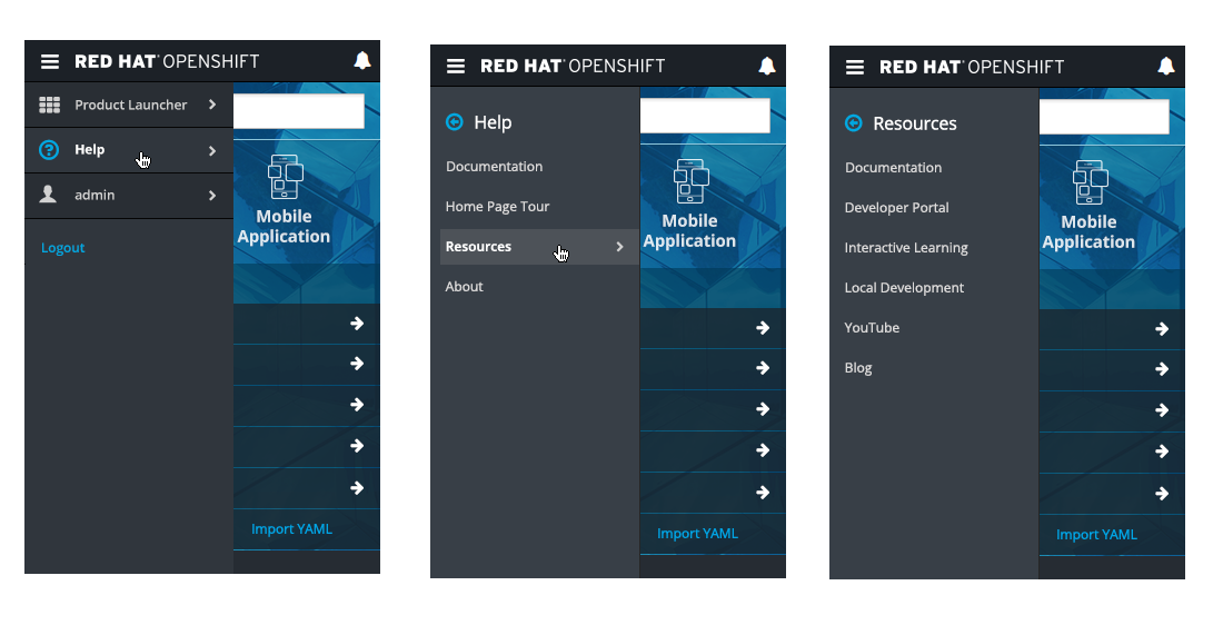
- Selecting the Help option will load the secondary navigation with all available resources and help links.
- The resource links that are initially shown on the landing page project panel should be included in this help menu and would load a tertiary level of navigation.
Launcher
- Selecting the Launcher option will load the secondary navigation with all link options that are available.
- Note: All options under the Launcher menu are configurable.
User
- Selecting the username should show the account options, region selector, set home page, and logout.
- The Region selector should be included in this user menu and would load a tertiary level of navigation, allowing a user to change the Region they are viewing.
- Note: The Logout option is duplicated underneath the user menu for easier access.
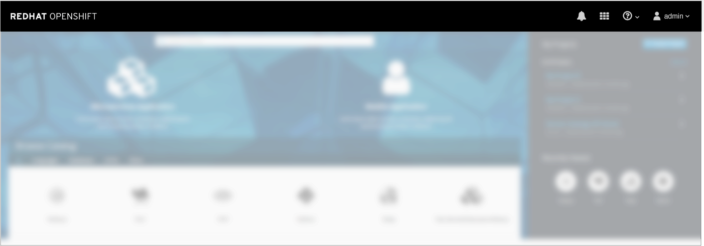
Inside the Console
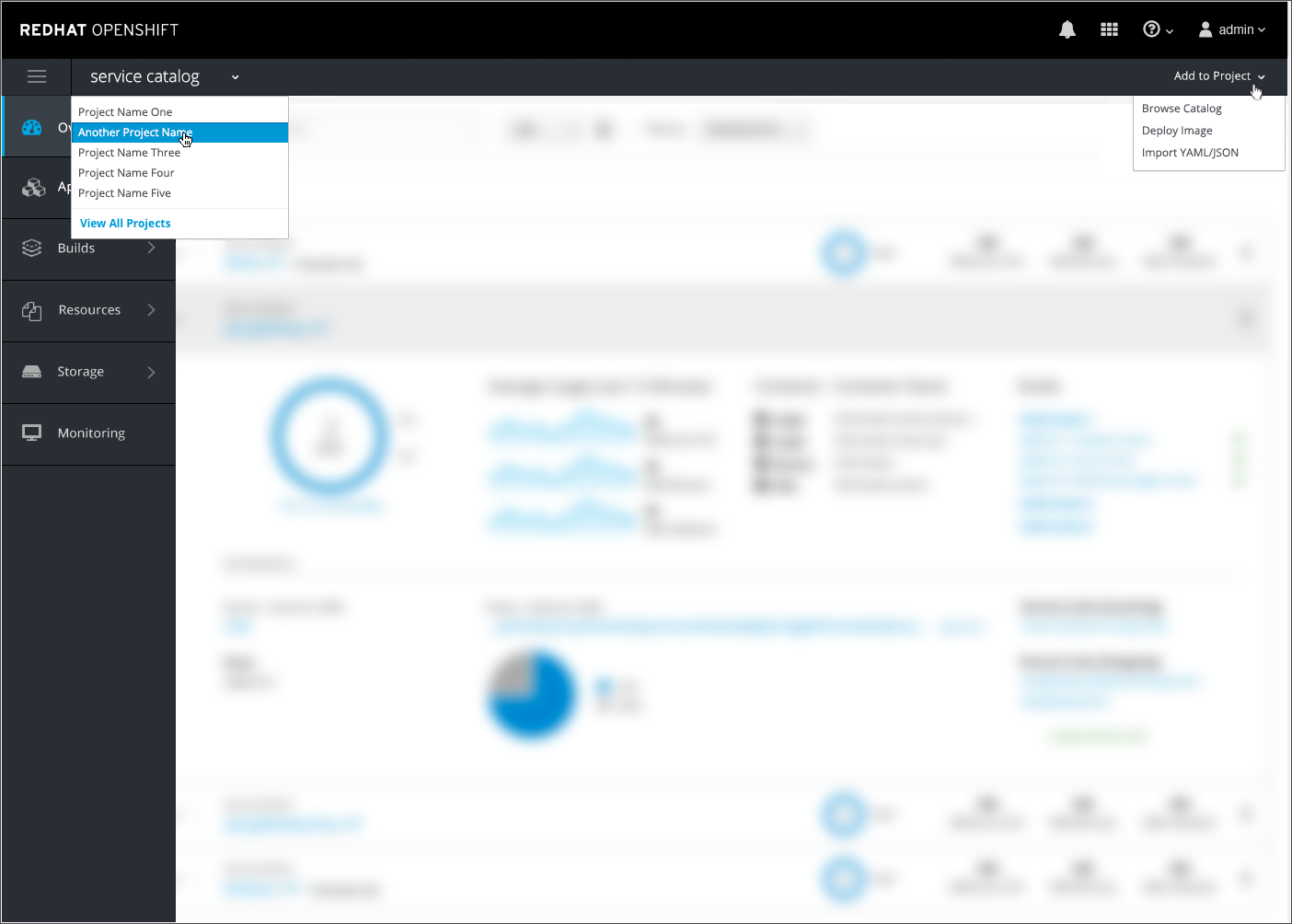
- Inside the console, the primary and secondary mastheads should remain in view.
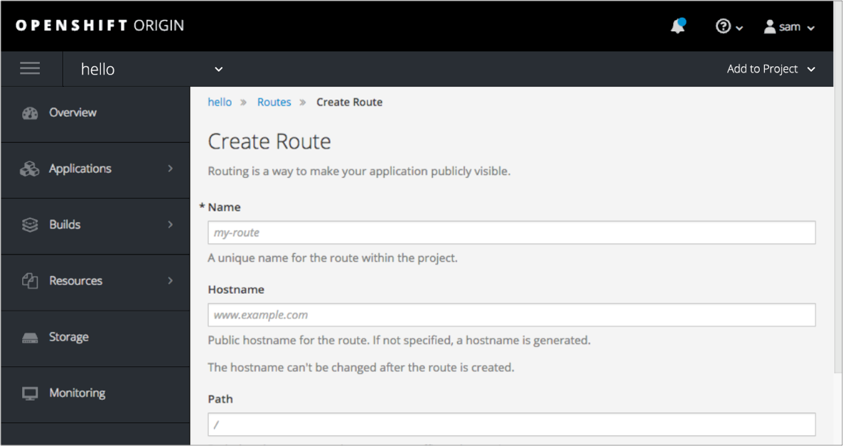
- The project name should be displayed on the left side of the secondary masthead with the Quick Add option on the right side and condensed into a + icon.
- The project name option will allow users to navigate to a different project or go back to the full projects page.
- Vertical nav options will be accessible through the hamburger menu, followed by the masthead options.
- The hamburger menu will scroll if needed.
- The notification drawer will not be placed into the hamburger menu and will remain in the top right corner of the primary masthead.