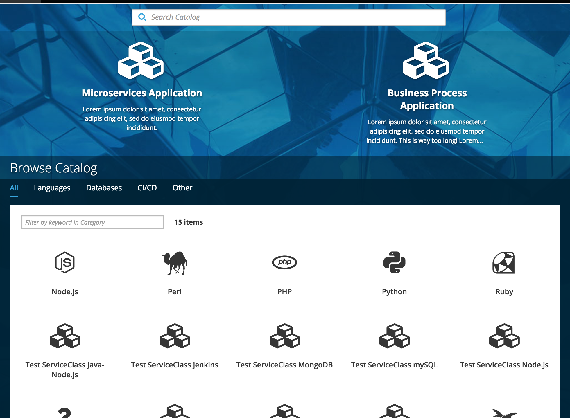
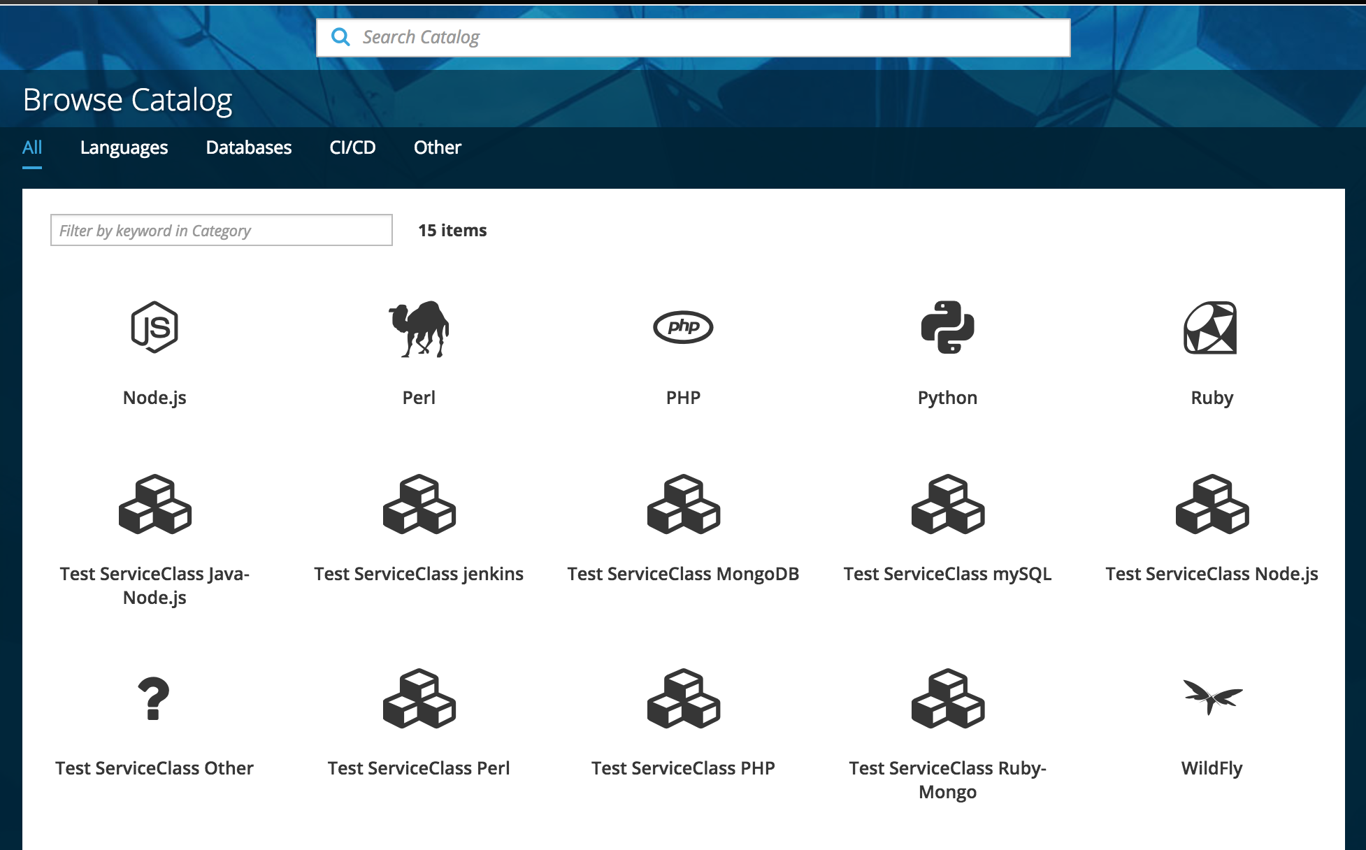
The search bar is located at the very top of the web console homepage
This component enables users to enter a query and receive a list of results.
The search bar is sticky at the top of the page.
As the user scrolls, the search will remain at the top with a portion of the background image still visible.
Search Catalog
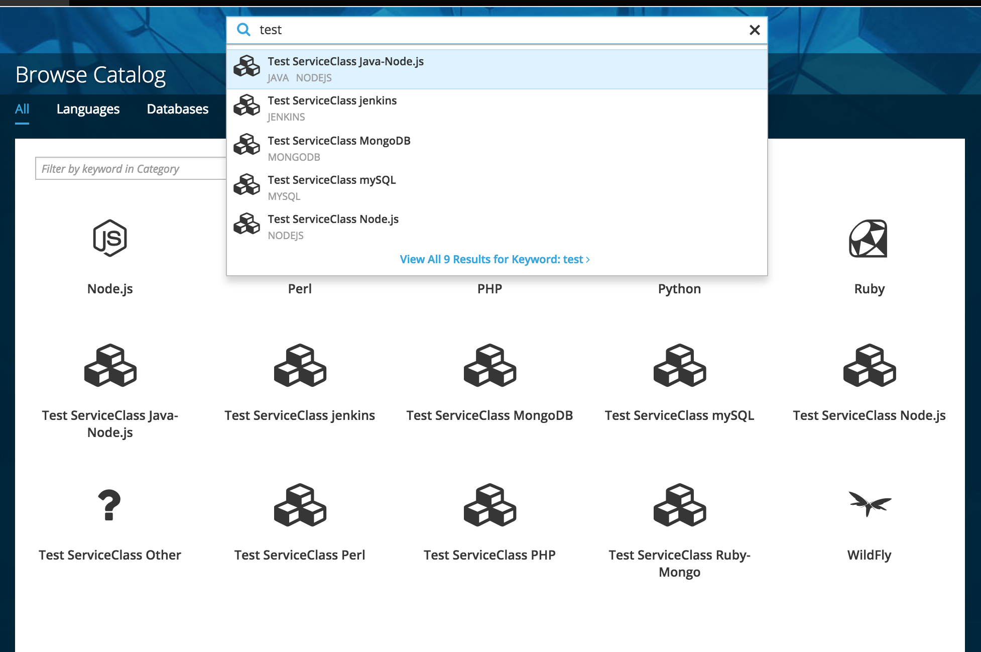
Entering a search term brings up a list of the first five matches.
The matches display the catalog item icon, name and any relevant tags.
Clicking on a match will trigger the order flow for that catalog item on the overlay panel.
Implementation Details
Catalog items will be able to be searched by (in descending order of importance):
Display name
Tag
Description (short and long)
The five results shown underneath the search bar should be weighted to show the most relevant results first.
No results will be highlighted until the up or down arrow key is pressed.
Pressing the Enter key while no results are selected will trigger the View all results action (see below for details)
If possible and practical, the search results panel should be updated as the user enters their search term.
View All Results
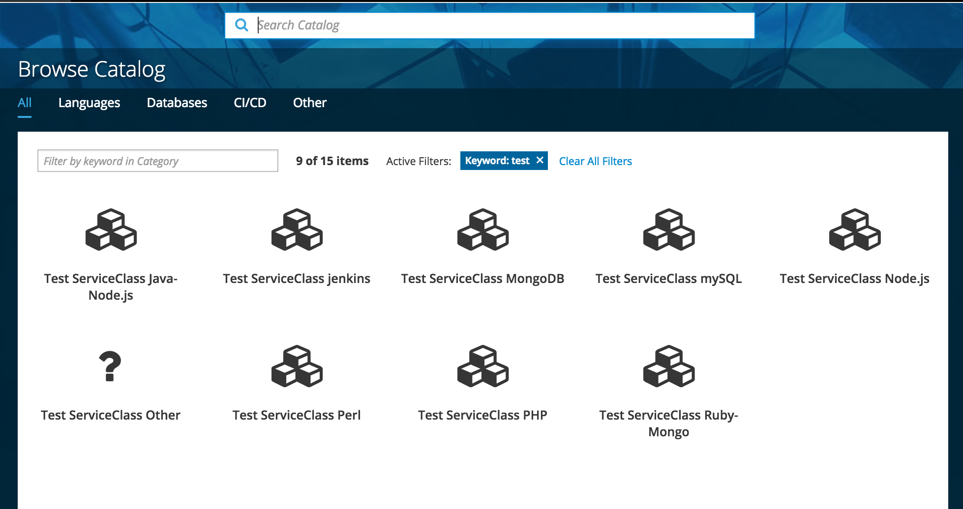
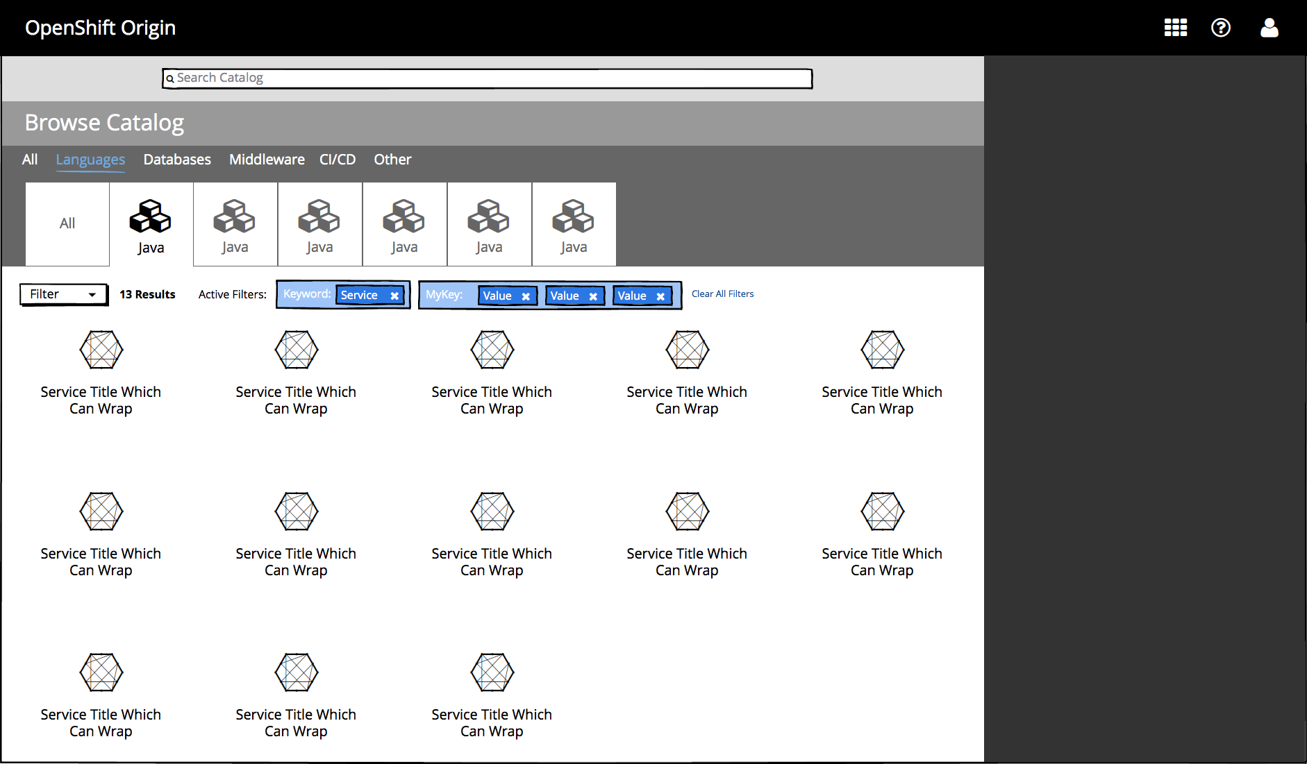
Clicking on the View All [n] Results for Keyword:[searchterm] link scrolls the user down to the catalog on the All Categories tab with an active “Keyword” filter for the search term.
Implementation Details
All active filters are cleared when the main search box is used so that it always produces a “fresh” page of results.
Additional keyword filters may be added by using the keyword filter box (see below for details).
Navigating to a different tab will clear the active keyword filter.
Customer Feedback (if applicable)
Necessary Customer Feedback
Is it clear that the keyword filter is a direct result of entering a search term?
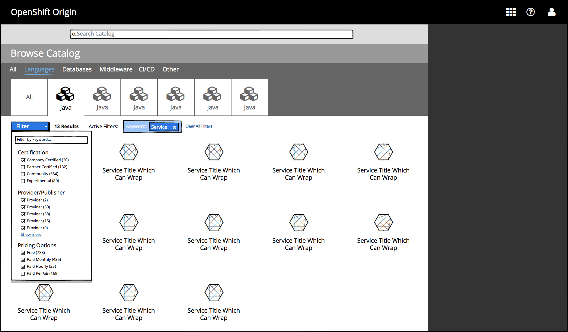
Filtering within a page
Users may narrow the items displayed on a catalog page by applying additional filters from the filter dropdown.
The keyword filter box creates an active keyword filter which displays only items with a Display Name, Tag, or Description (short or long) that matches the keyword.
Unlike the main search bar, Filters are applied to the currently active page rather than taking the user to the All category page.
Typing a new term into this box will add a new keyword filter to the current page with an AND relationship to the previous keyword filter.
Filter checkboxes enable users to quickly add and remove filters within different categories
Filters added from separate sections are combined with an AND relationship.
Filters within the same section are combined with an OR relationship (e.g. show me services that are free OR billed monthly).
If possible, filter categories should only show up to five filters at a time with a show more link to reveal the rest of the list.
Clicking outside of the filter dropdown should close the dropdown.
Rules for active filters
Filters exist only within the scope of the currently selected category and subcategory and their behavior reflects this:
Filters do not persist when a different category or subcategory tab is selected.
Filters are not saved on the page for when the user navigates back to a category or subcategory tab (Using the browser’s back button should restore the state of the previous page including filters, however).
An active filter that yields 0 results in a given category or subcategory must not cause the tab to disappear. This is true for the currently selected tab as well as other tabs.
Implementation Details
If it is possible to determine the number of items that match a given filter, that number should be displayed next to each filter in a list.
If it is possible to determine that the current keyword filter constrains the page’s contents to a single other category or subcategory, filters for that category should be shown instead.
In the short term, standard PatternFly filter token styling may be used.
Ultimately, these tokens should be updated to match the below mockup