Empty States
Description
- The empty state pattern should be used in the following cases:
- When a page is empty because a feature is not installed
- When a page is empty because nothing has been created yet
- When a page is empty because an applied filter results in a null set
- When a page is empty because the user does not have access to any resources
- When a page is empty because the user does not have the correct project selection
Design
- The empty state pattern should be beneath the toolbar
- The toolbar should be greyed out
- Page elements such as buttons and text fields should also be in the disabled state
- Exception: the toolbar should remain active in instances where an applied filter results in a null set
- The empty state pattern should be used without an icon
- The empty state pattern should use a large primary button for the call to action
- Exception: external links and “Clear All Filters” should be links rather than buttons, and pages where users have restricted access do not require a CTA
- The empty state content should generally describe to the user why the page is empty and what they can do to populate the page
- Empty state descriptions on object pages where nothing has been created yet should include information on what the object is and how it is useful to the user
- Exception: the filter empty state description is optional depending on the type or number of applied filters
A feature is not installed 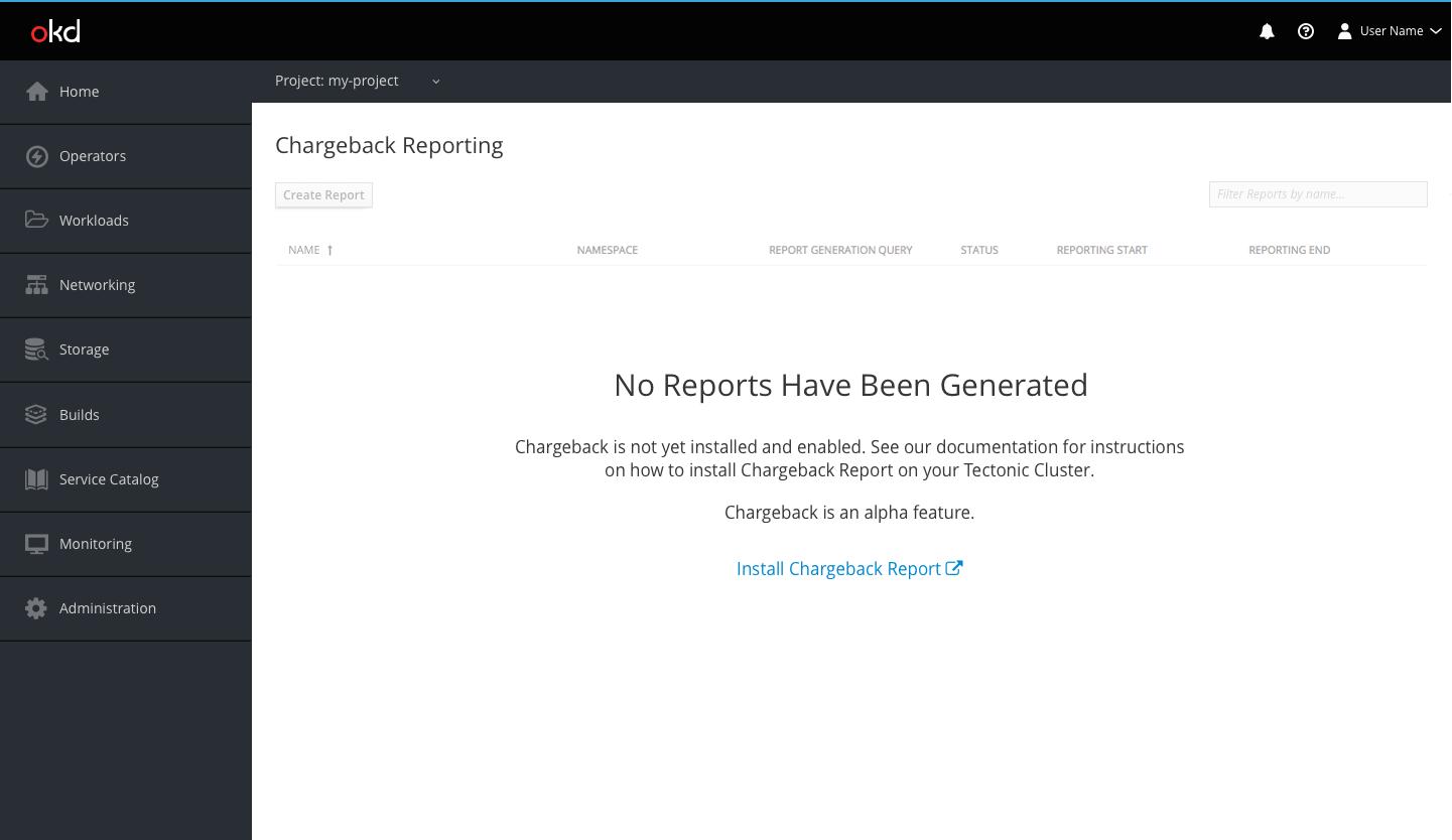
Nothing has been created yet 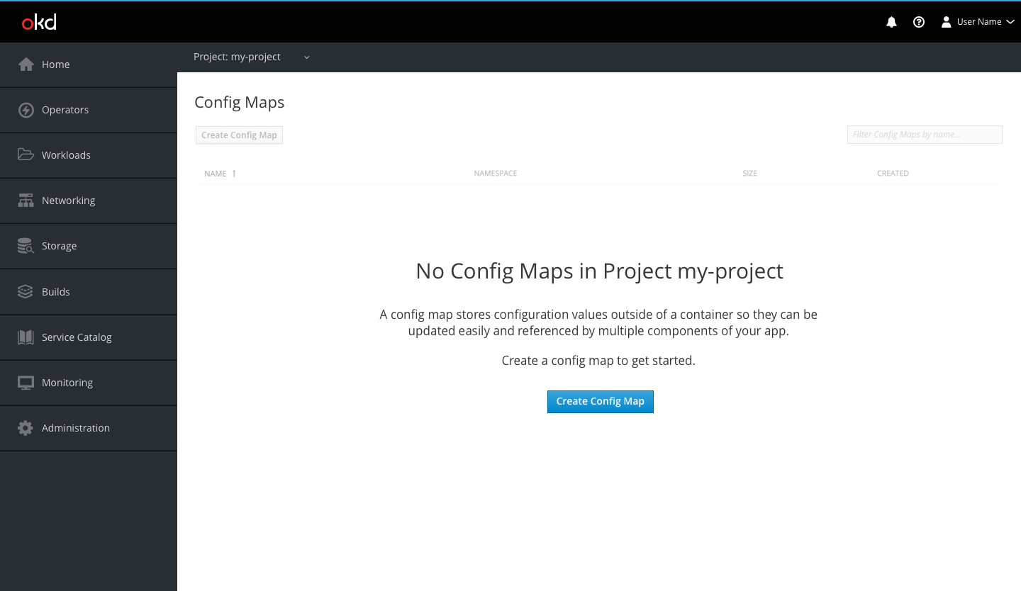
An applied filter results in a null set 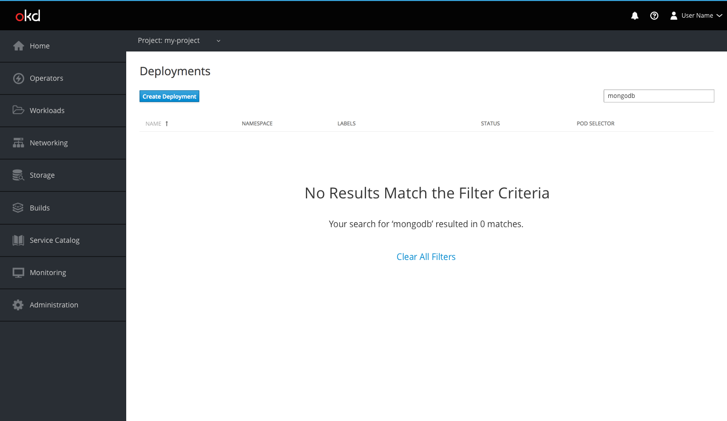
The user does not have access to any resources 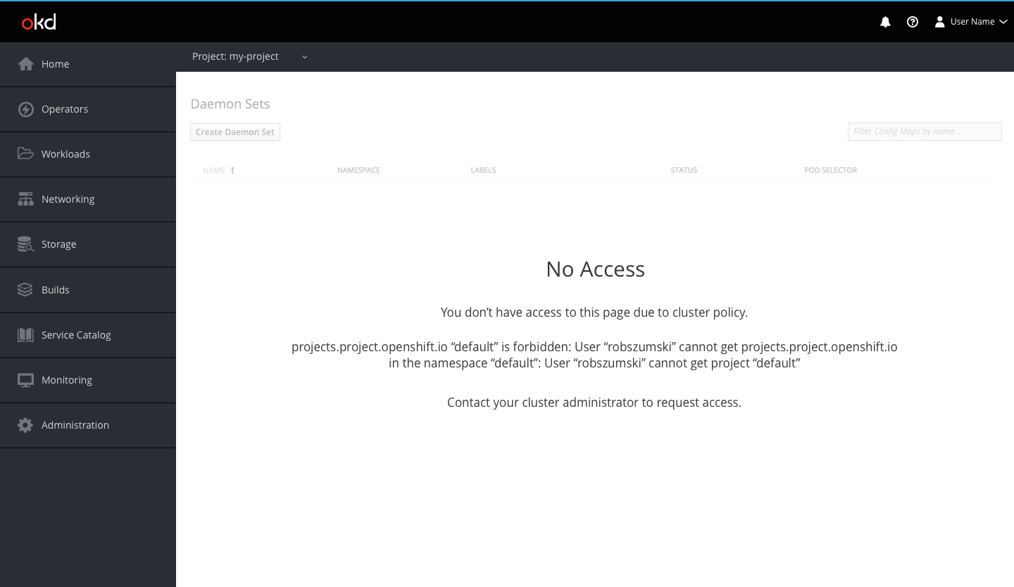
The user does not have the correct project selection 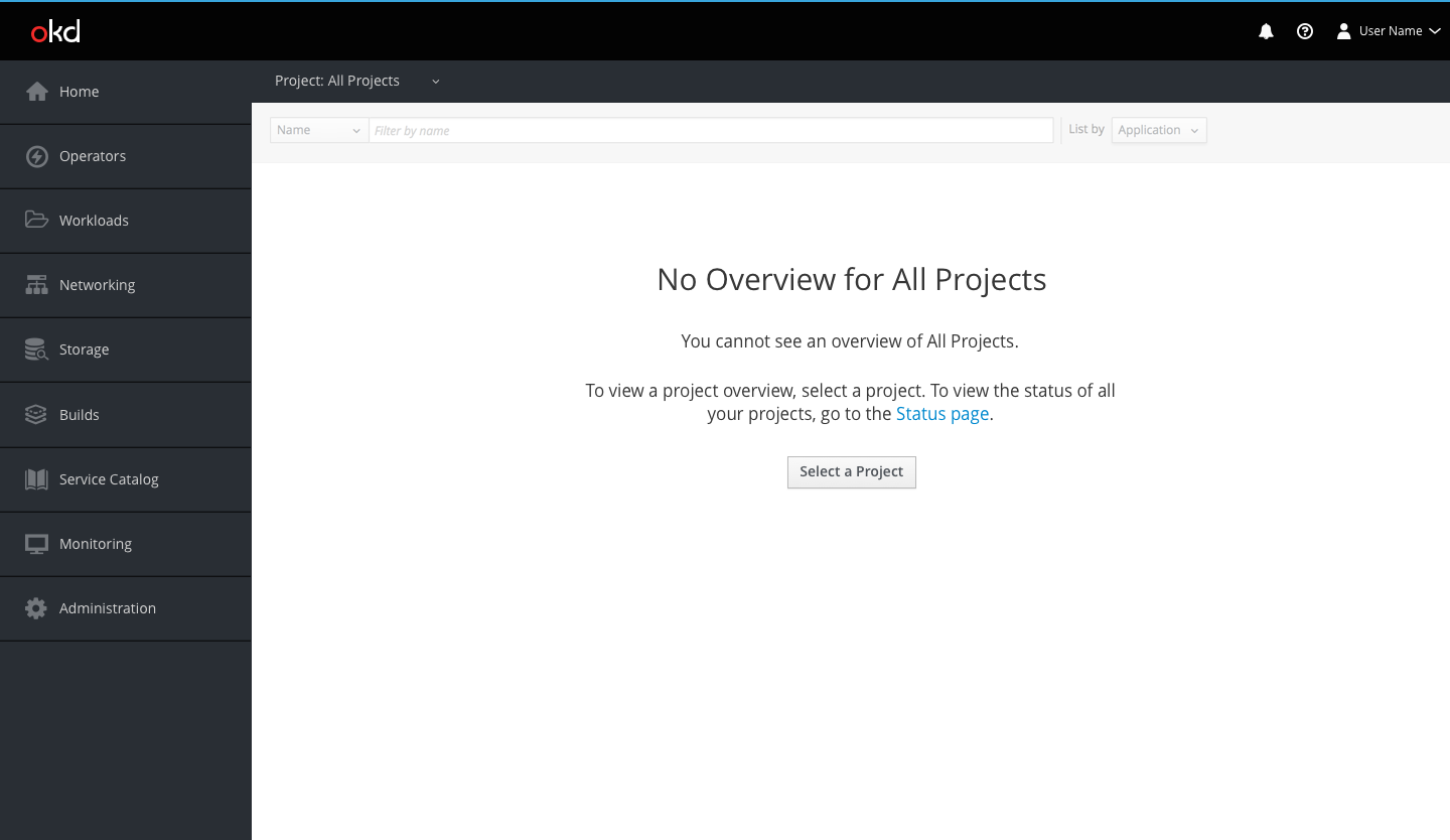 Note: Clicking the “Select a Project” button will open the project selector dropdown.