Getting started card
Background
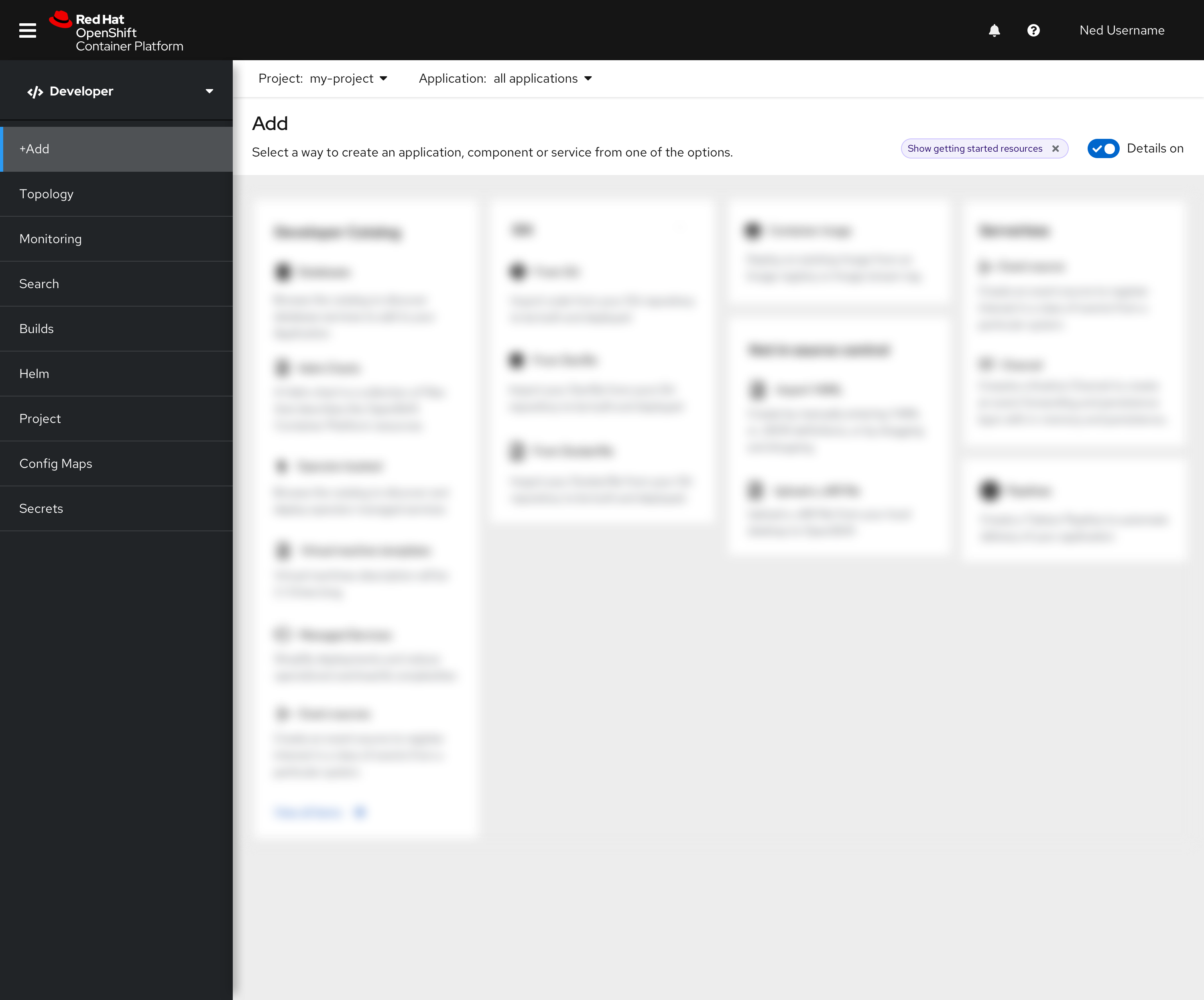
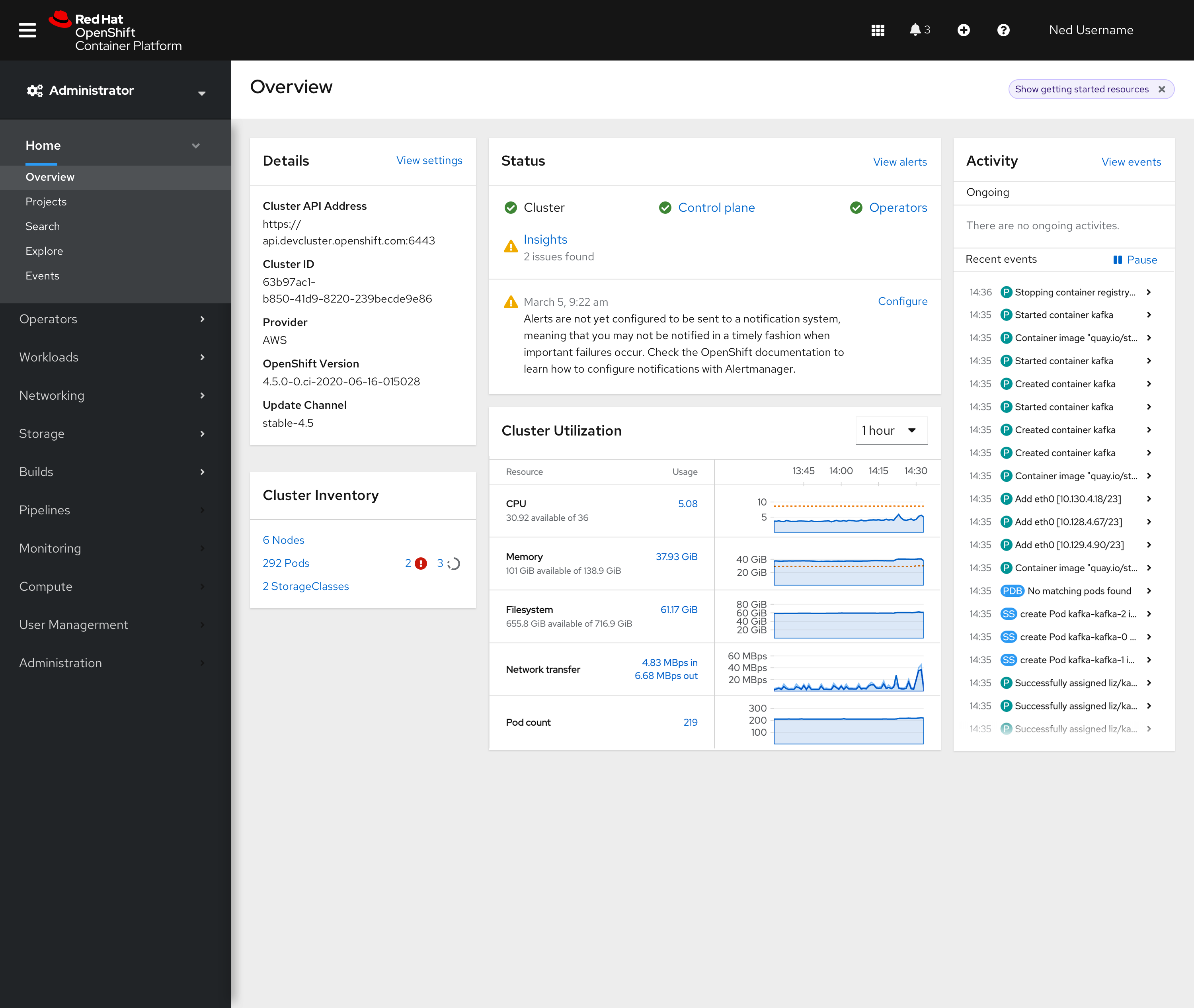
A quick starts card exists today on the following landing pages for the Admin and Developer perspectives with the goal to help users learn and use resources in the Console.
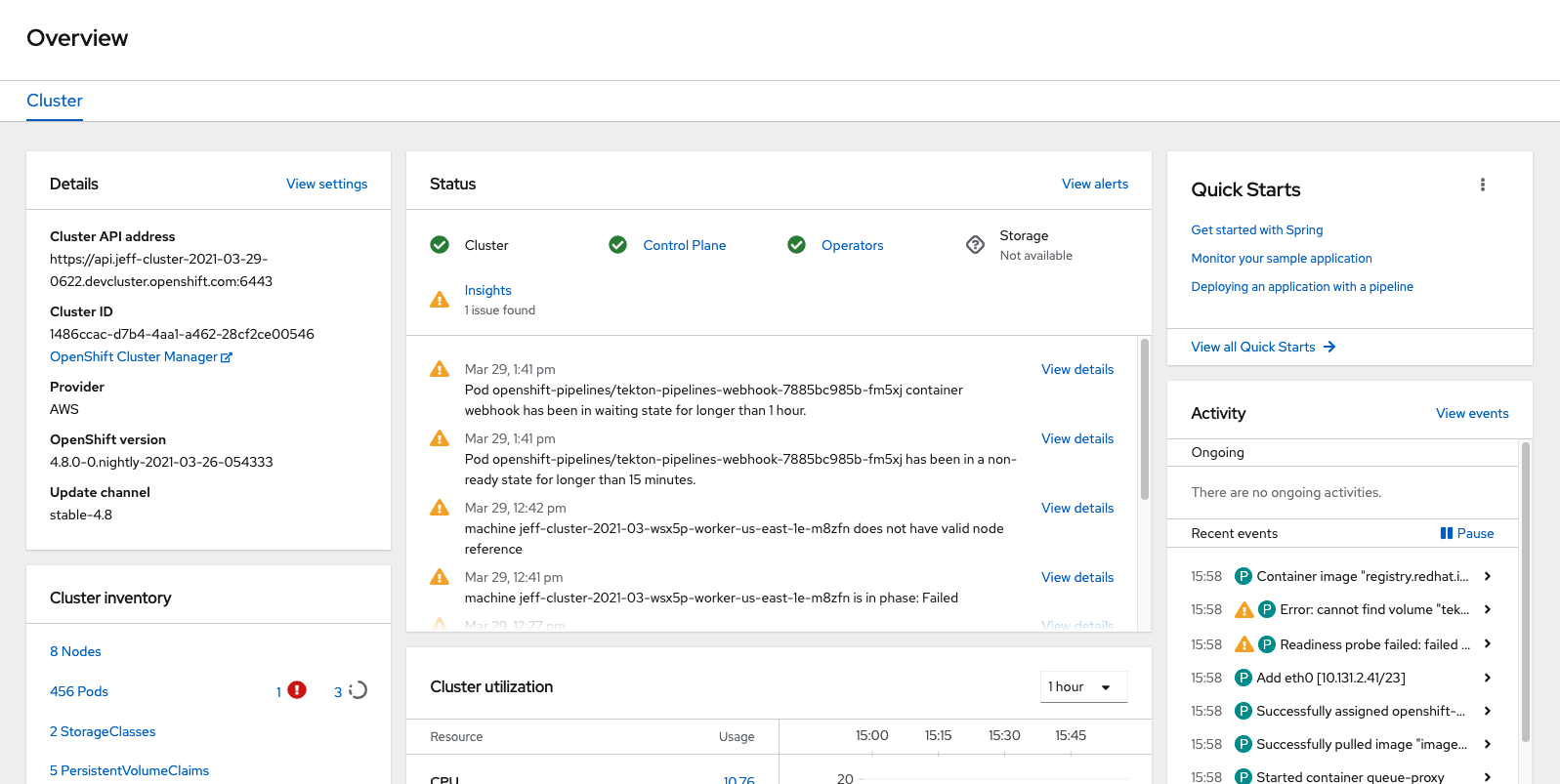
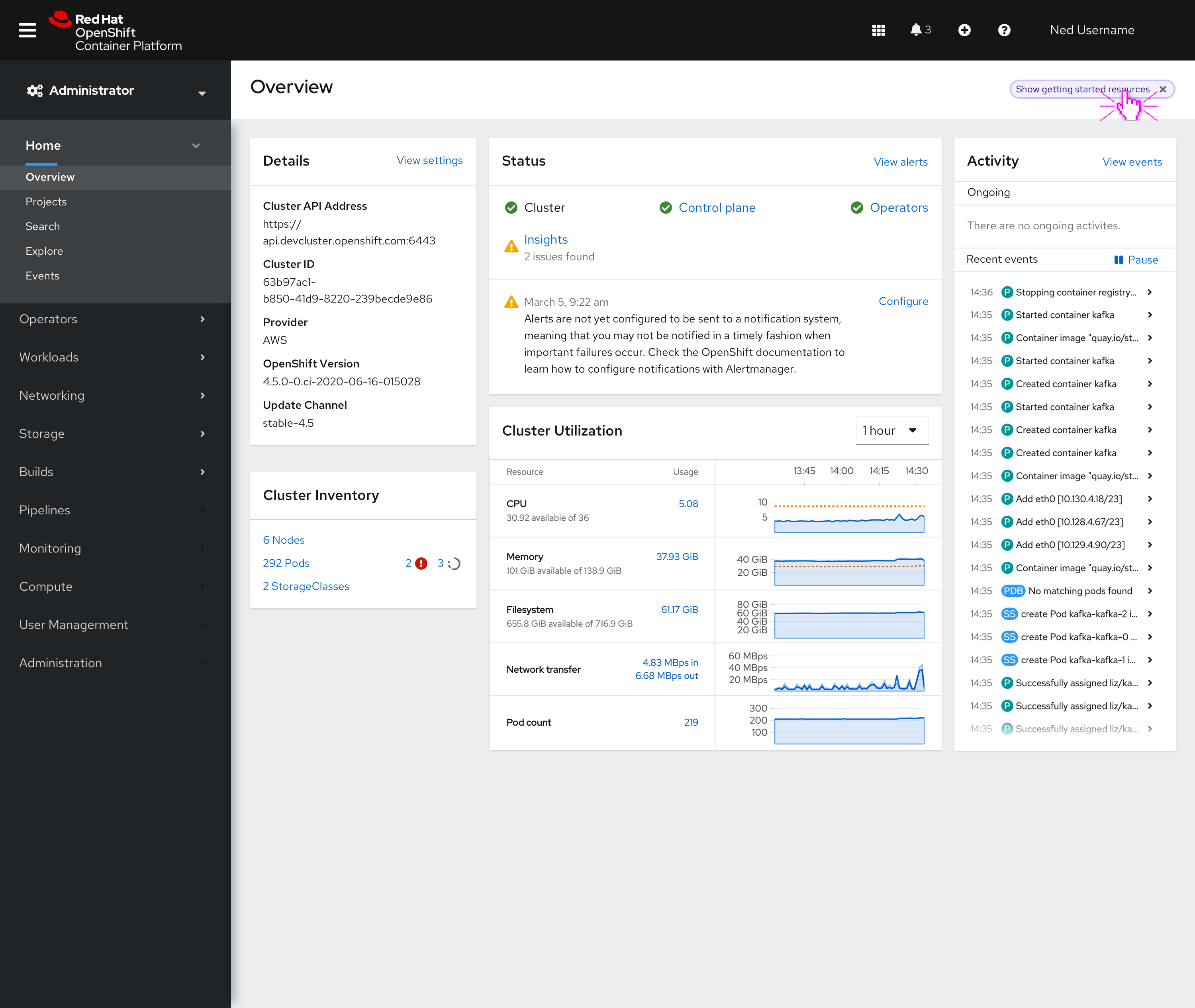
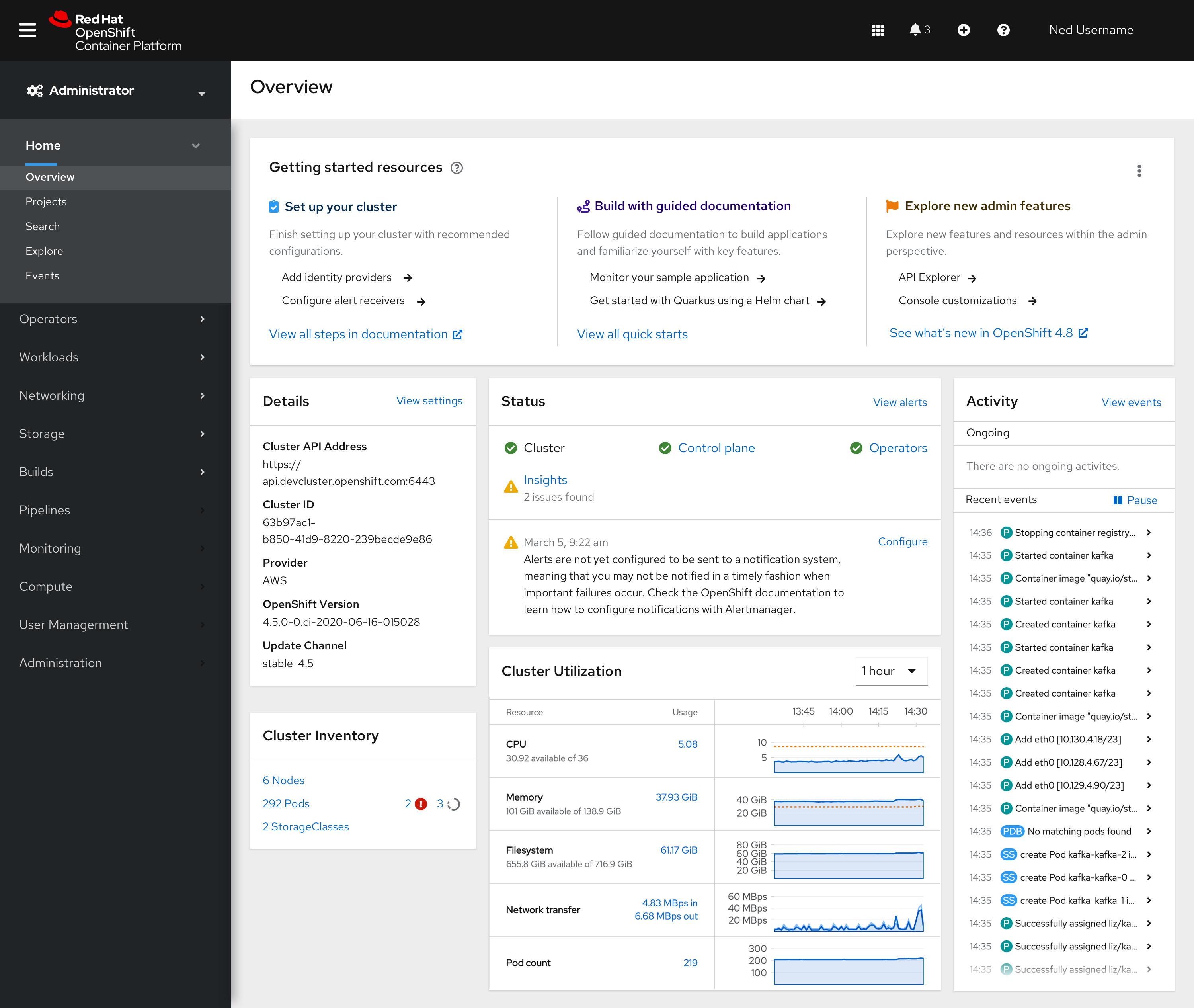
- Admin Cluster Overview dashboard
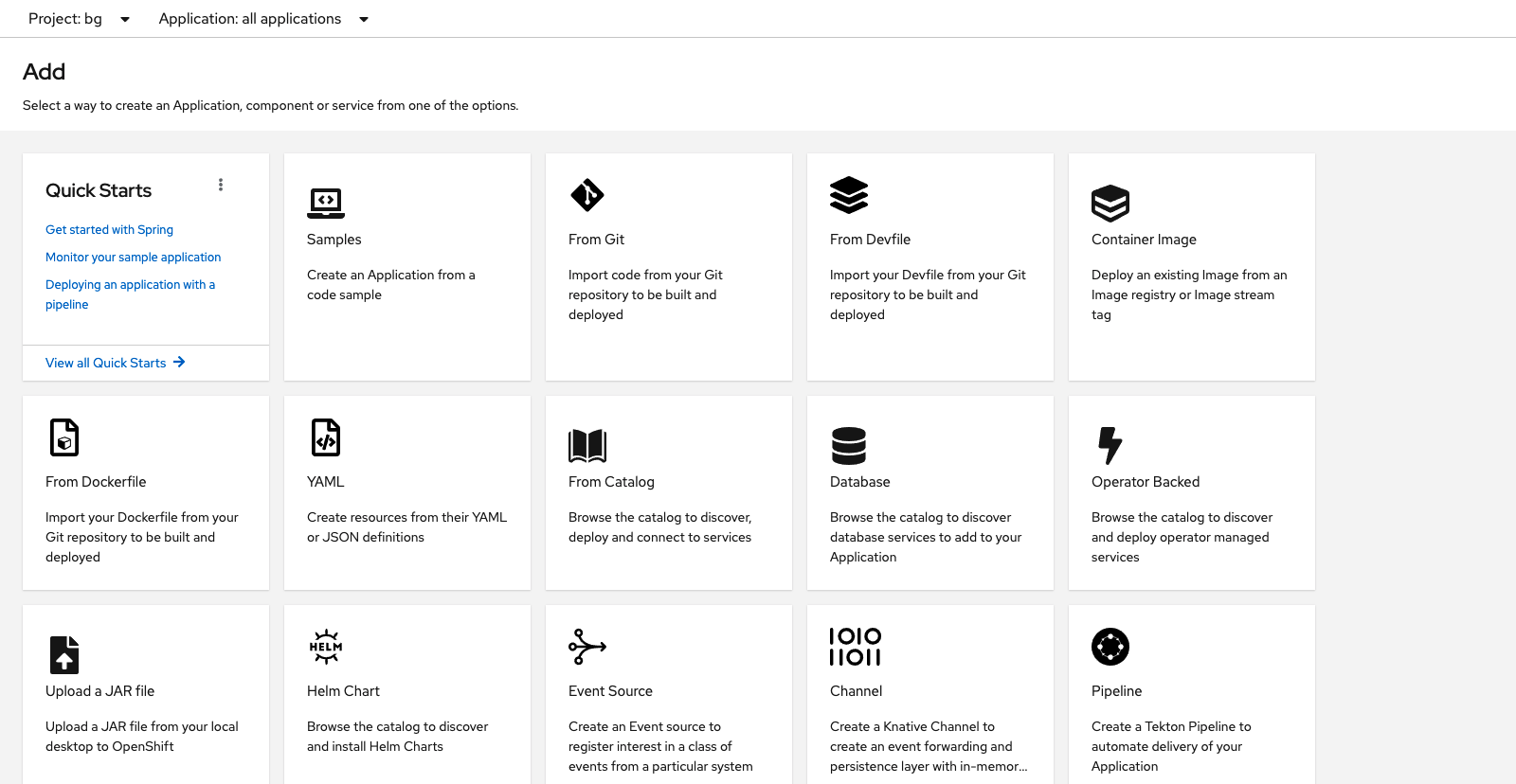
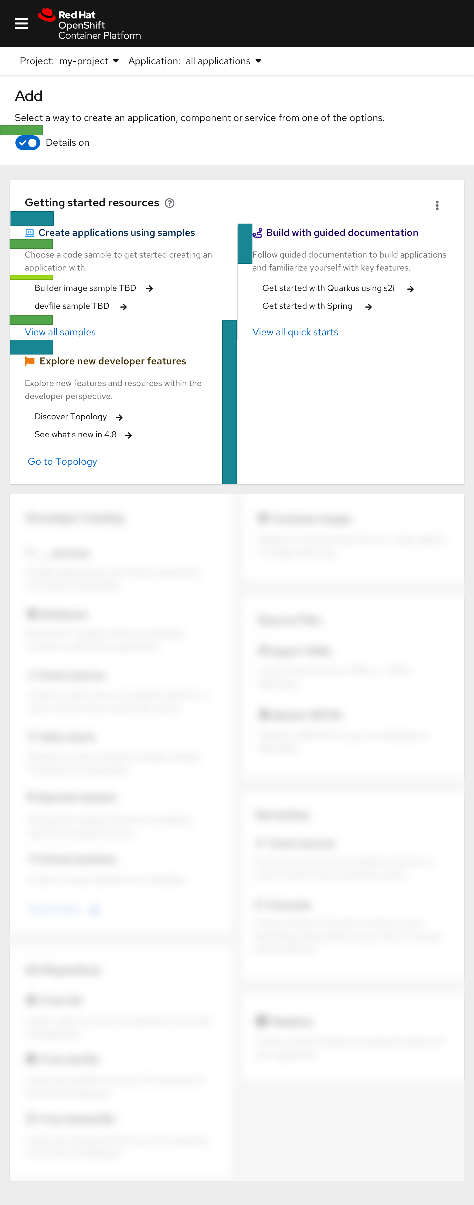
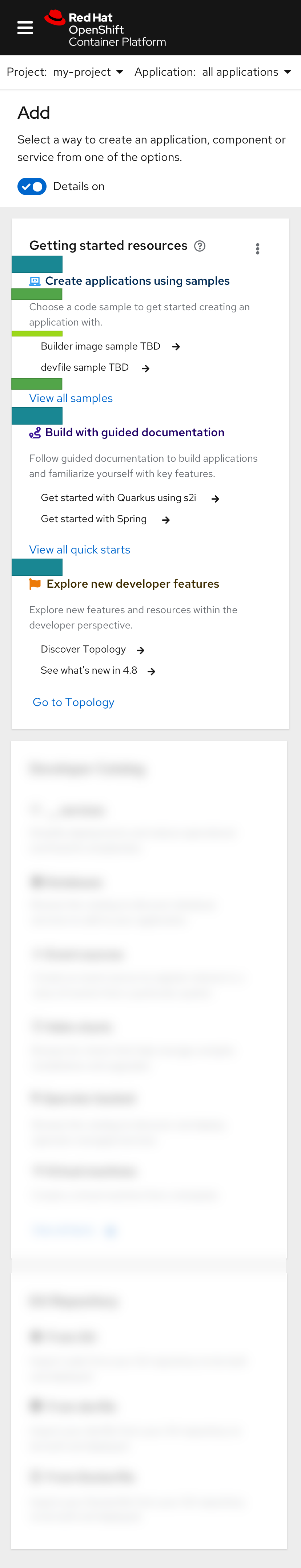
- Developer Add page
Goal
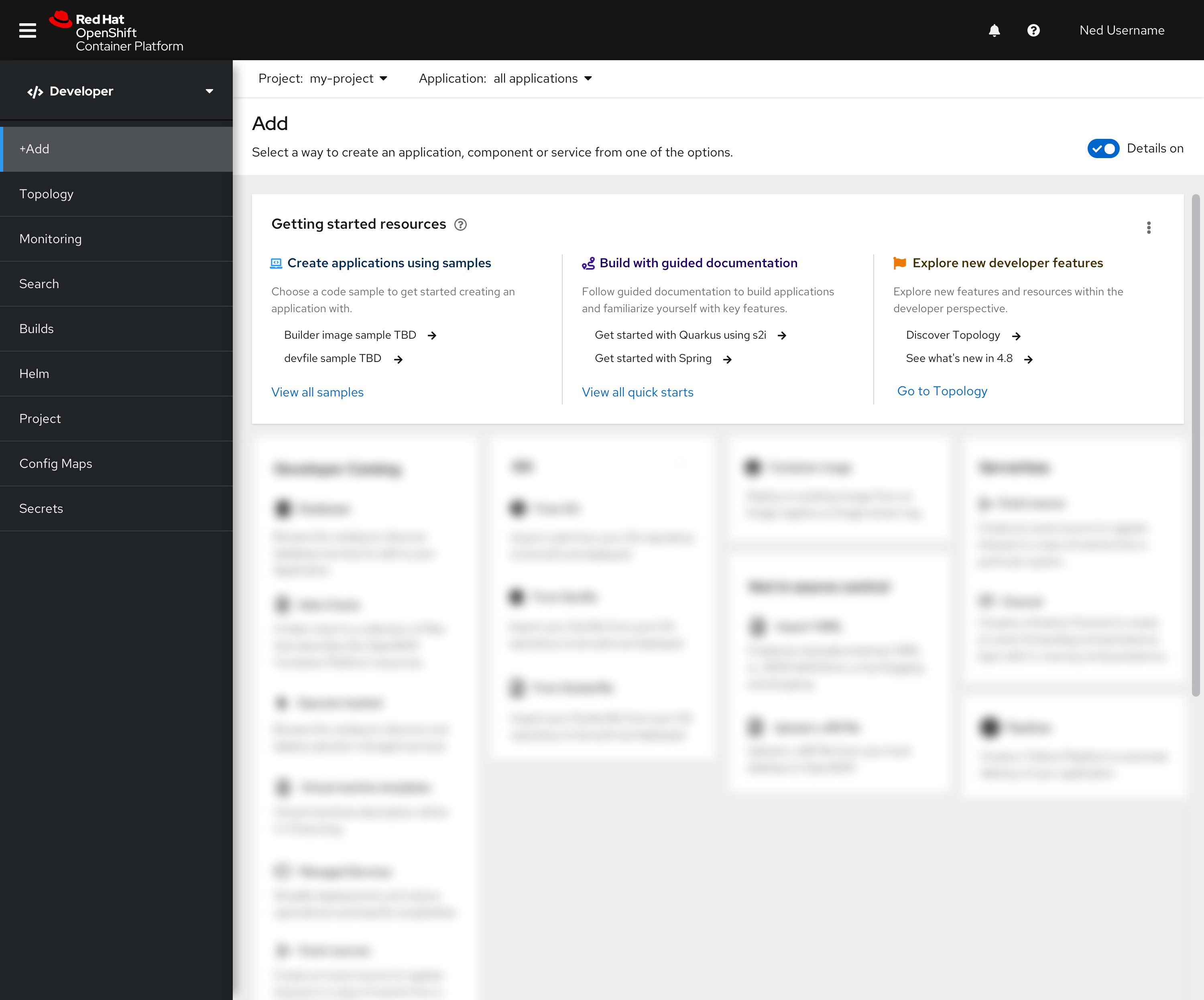
As our getting started efforts expand, we realize that we can capture more than just quick starts to help users get started. The goal of this larger Getting Started card is to supply users with many different pathways to learn and use resources in the Console. This card will replace the existing quick start card on both the Add page and Cluster Overview.
Card design and interactions
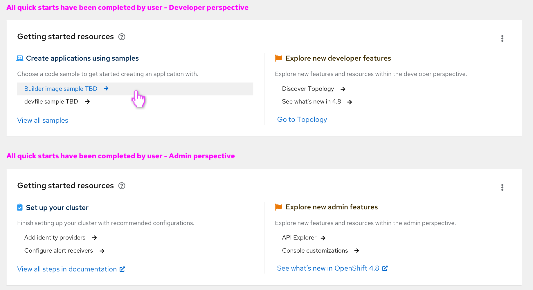
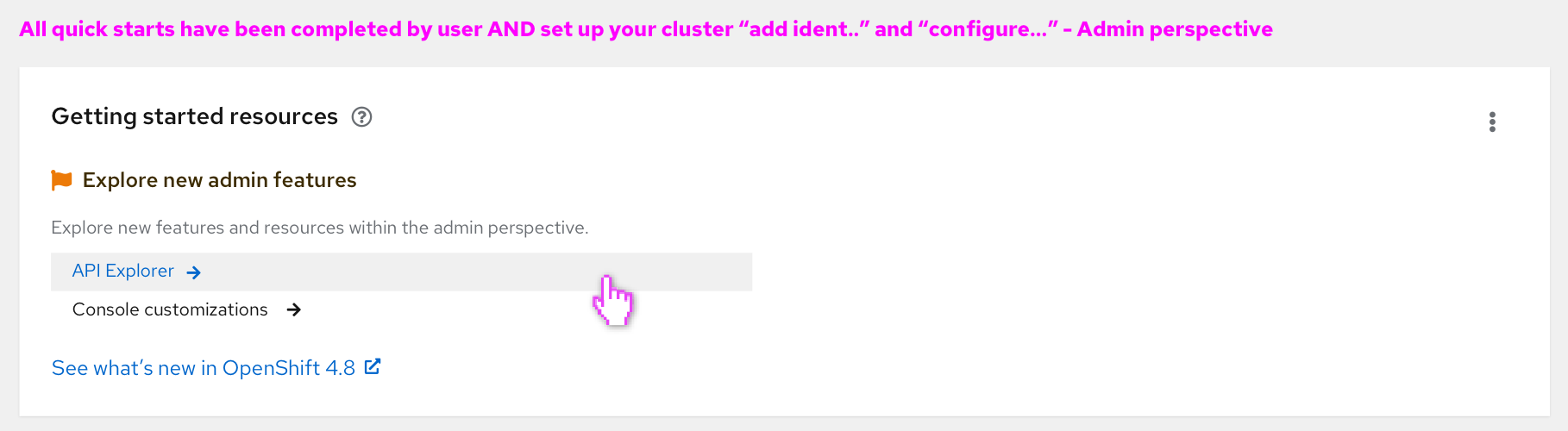
The design of the card will remain consistent on the Admin and Developer perspectives, but the content within each column will vary. The reason for this is because there is featured content we would like users to see depending on the perspective they land on.
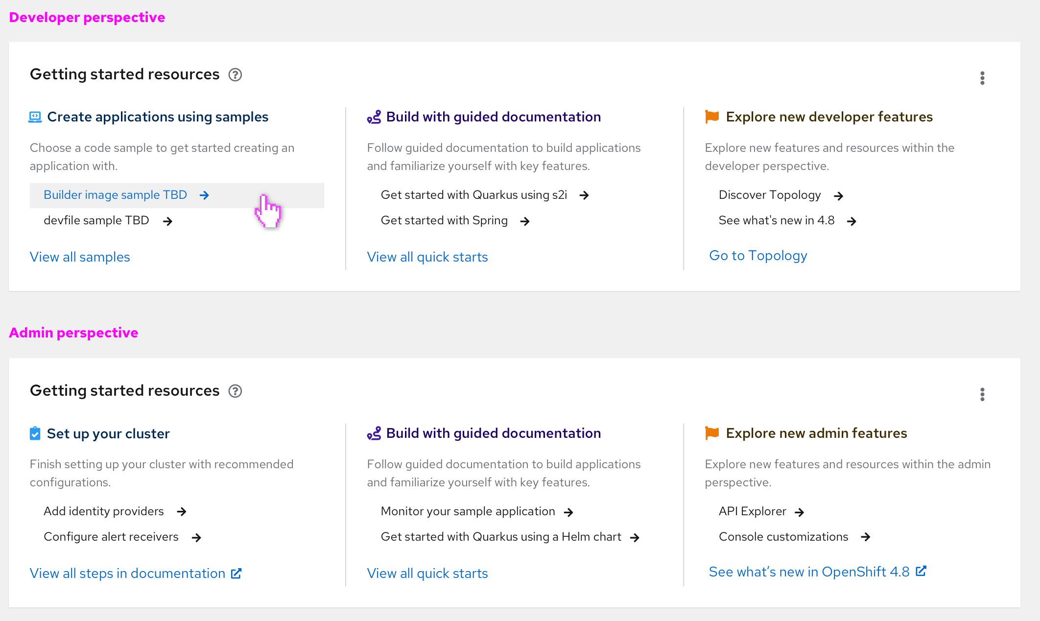
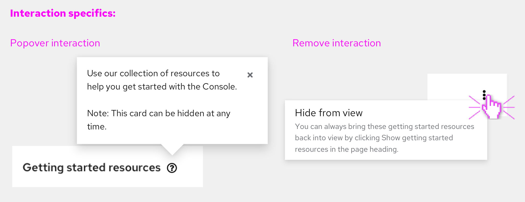
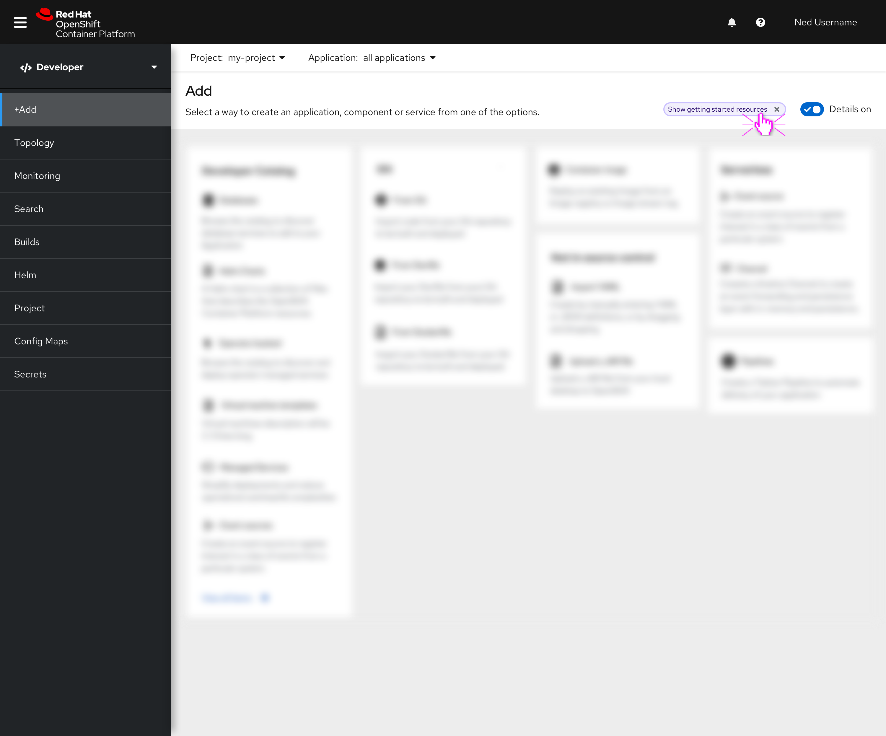
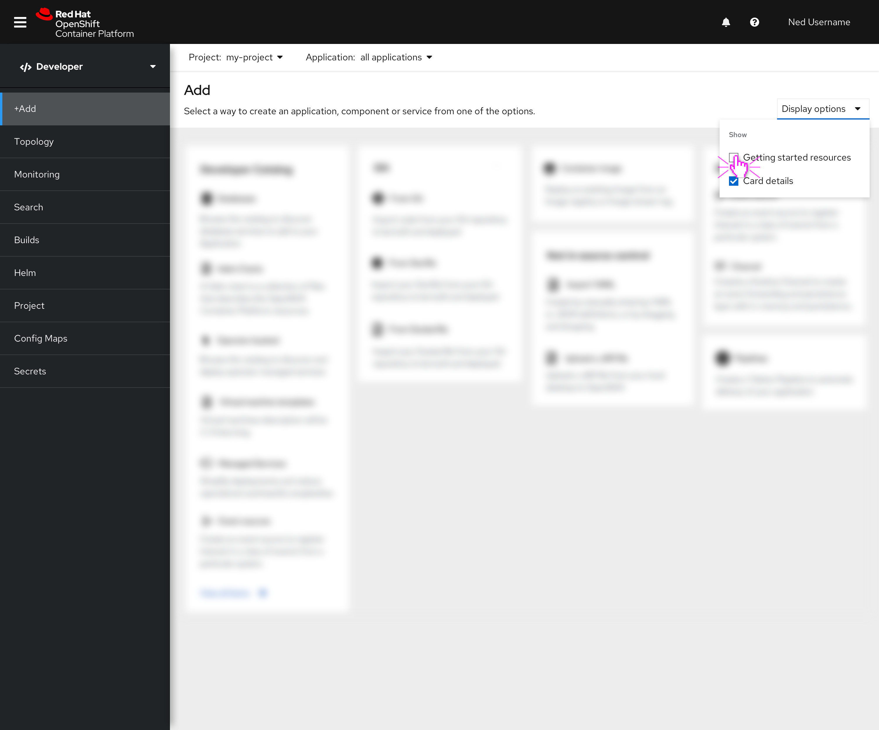
A popover next to the card title will explain more about what “Getting Started” means in this context. The card should also be able to be hidden, considering there are going to be users who do not want to see it.
When certain columns have been completed, the column should disappear and the remaining content will fill the card. This rule should be applied to the following:
-
Build with guided documentation (if the user completed ALL available quick starts, this column should disappear)
-
Set up your cluster (once identity providers have been added and alert receivers have been configured, this column should disappear)
Content guidance
This card can be used as a getting startted template for landing pages for dynamic plugins. Here are some guidelines to consider:
- There should be no more than two items per category, in an attempt to not completely overwhelm the user.
- Each item is (and should be) actionable, no matter the users’ permissions.
- The link text at the bottom should be sending the user to a more general space for that category. For example, “Build with guided documentation” lists out quick starts. We added a “View all quick starts” link at the bottom to send the user to our quick start catalog page so that they can see all that exist.
- There should be a limit of 4 columns in total on the card
- If it is possible, validation should be included per column. For example, if a user were to complete the items shown in one column, that would disappear. Then the remaining columns would move to fill the card.
Hiding and adding the card
A kebab in the top right corner of the card will allow the user to hide the card.
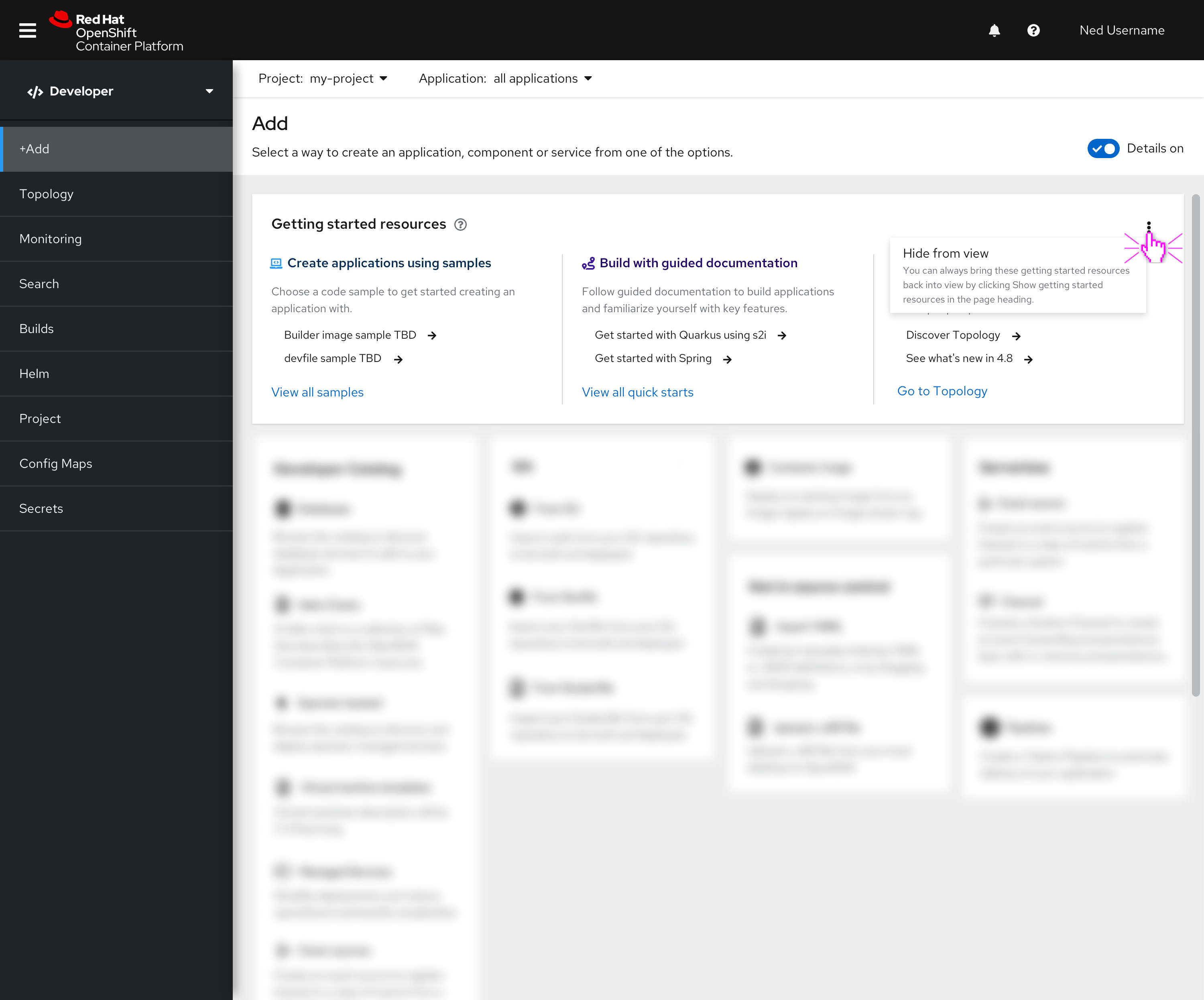
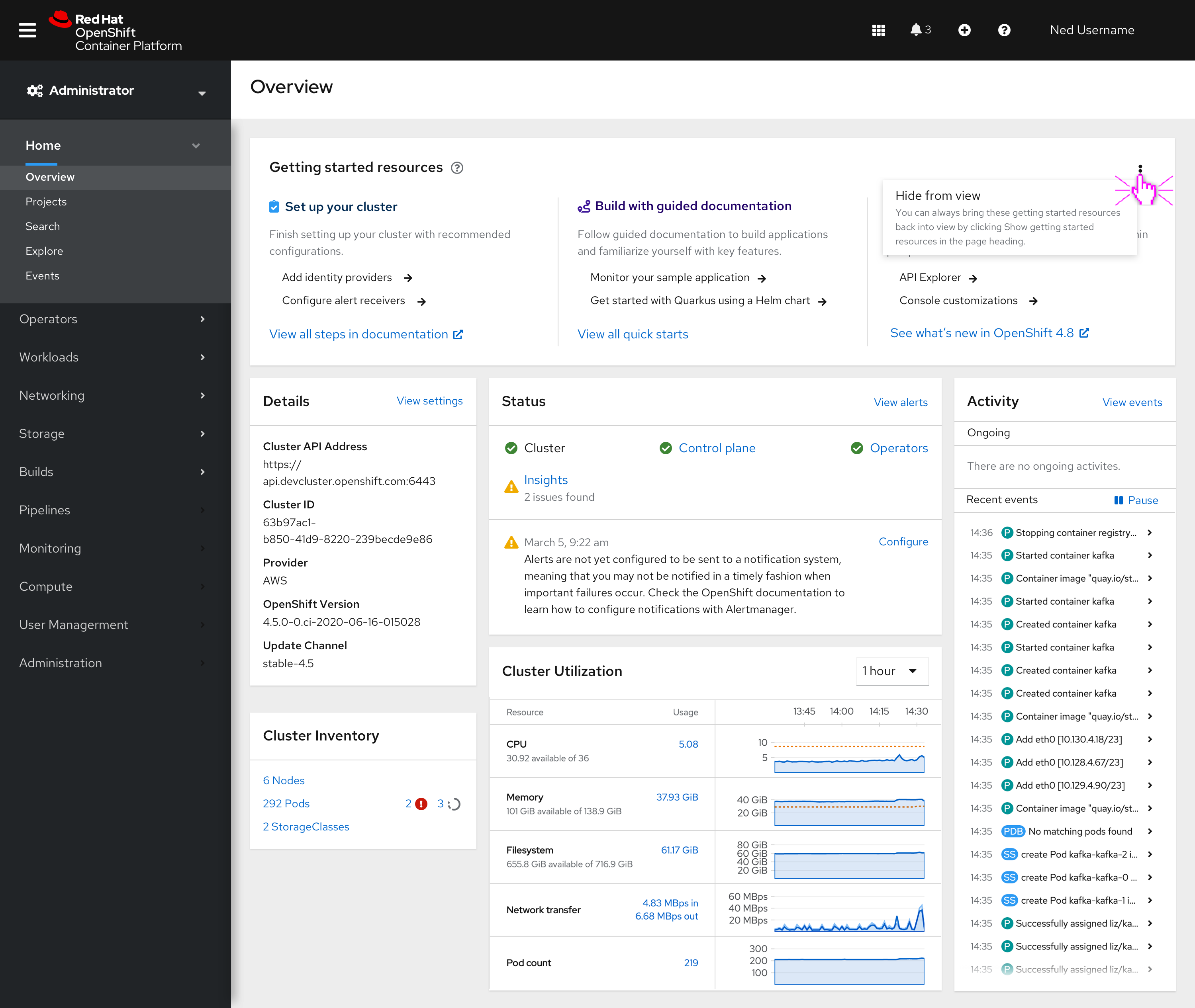
Once the card is hidden, a label will appear in the page header, allowing the user to bring it back. This label acts more as a “hint” and is dismissible itself, in case the user has zero interest in seeing anything getting started related.
Selecting the label will bring the card back onto the dashboard.
Responsiveness
PatternFly has a card demo with this type of layout used within a horizontal card that can be accessed here. The tablet and mobile views should follow what is shown in that demo, which is the same as below.
Future design iterations and considerations
The following are ideas for future designs of this card that would make the experience more ideal.
Hiding/Showing the card
Instead of using a label to show the card again, creating a broader getting started catalog page would allow the user to visit that page to look at getting started resources again after hiding the card. This could live in the help menu and take over the current quick starts catalog. 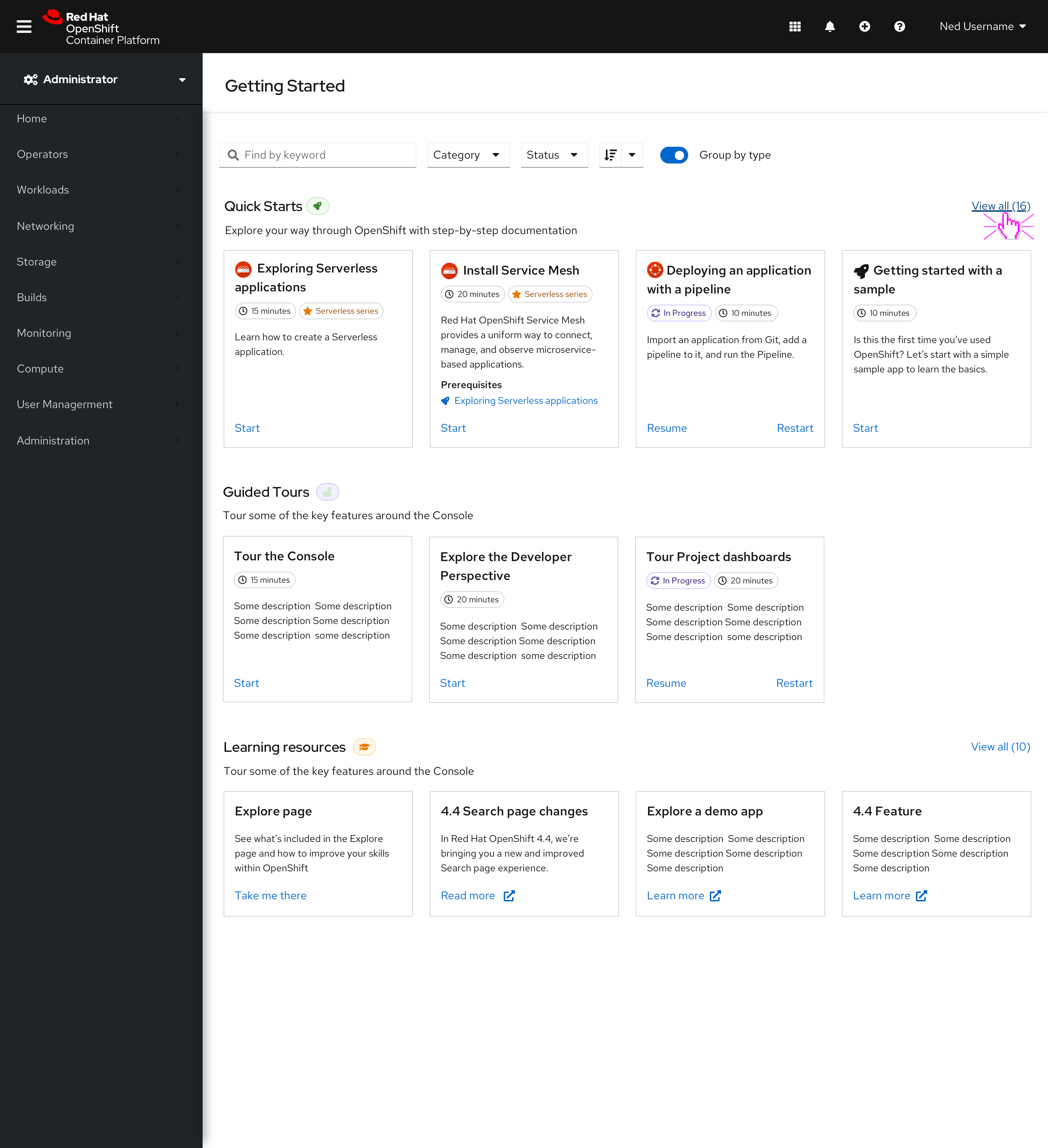
If the catalog idea is too forward-looking, we should look to combine the show getting started resources label and show details switch on the Developer Add page. 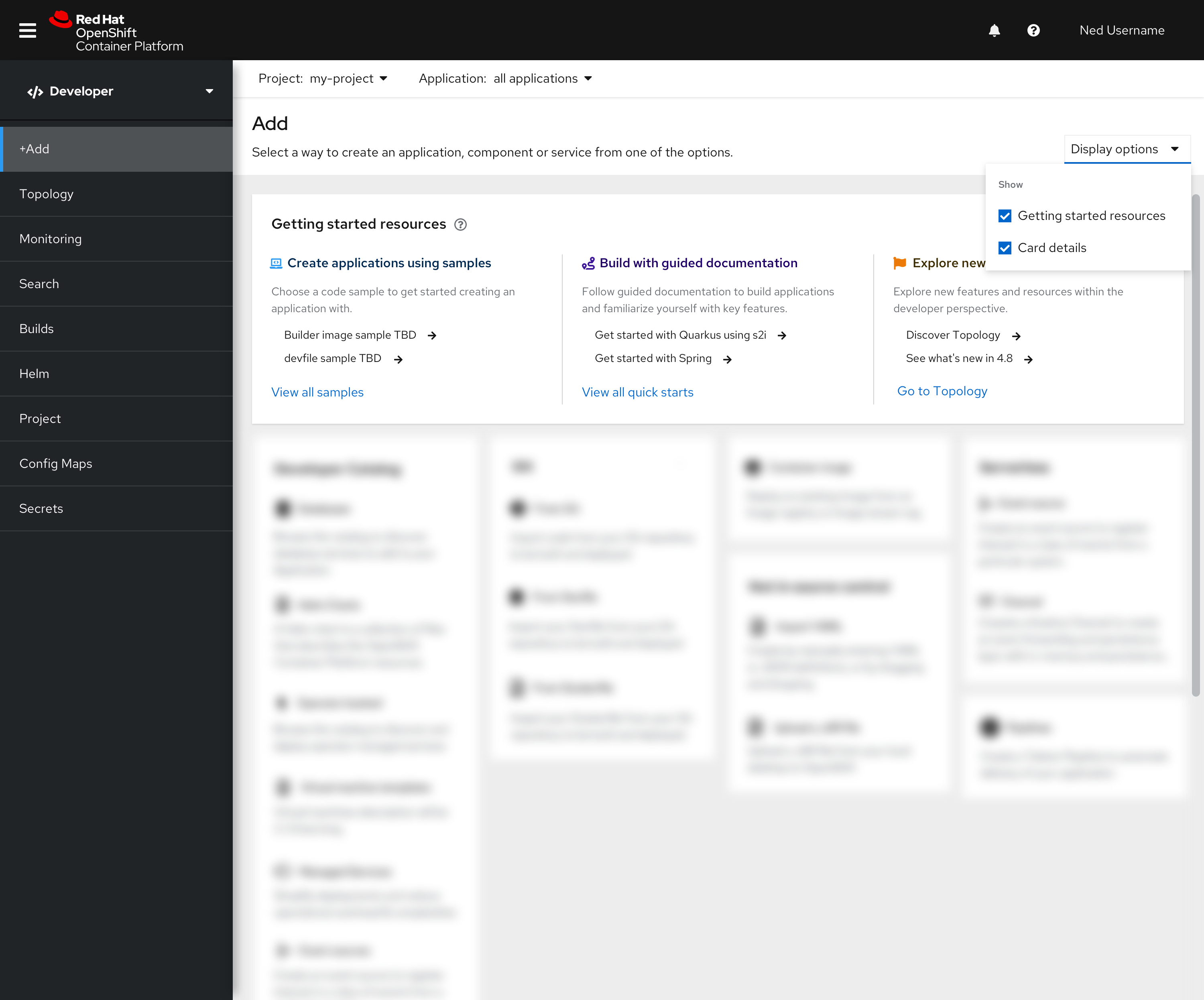
Card content
Instead of using static content, we could make the content more dynamic and refresh it based on new releases. For example, new features to list on the card depending on what OpenShift version you are using.
We could also allow for the content to be more personalized per user. Meaning we would have to include some sort of survey to capture the users’ interests and then display that content on the card AND/OR allow for admin customization of what is shown on the card.