When alerts are firing, a special signifier icon appears in the masthead for users with appropriate RBAC permissions. Clicking on the icon opens the notification drawer.
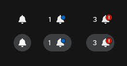
When there are no notifications, the masthead icon displays only a bell.
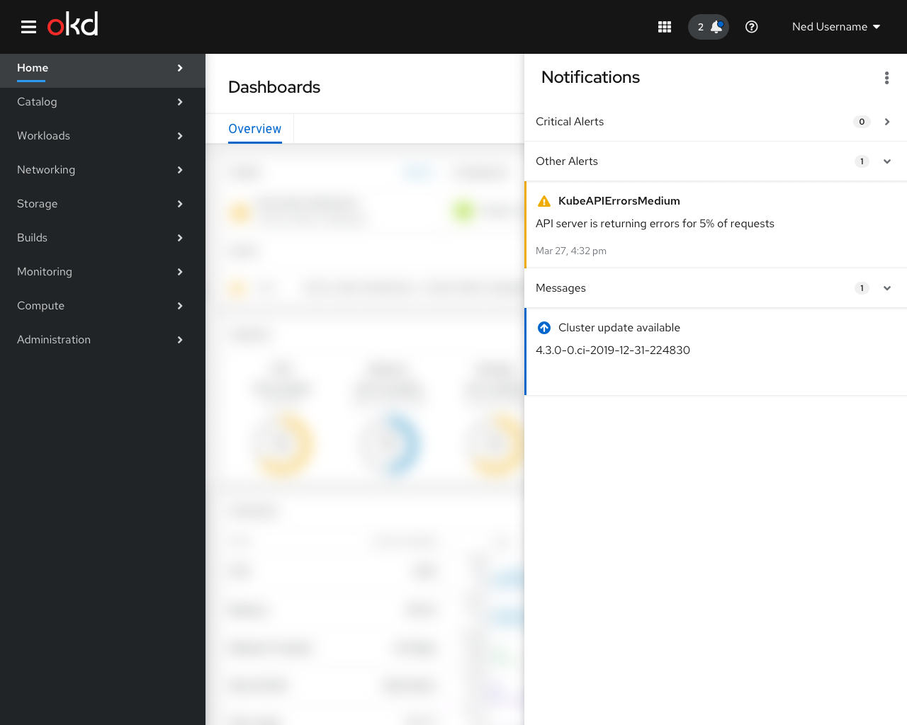
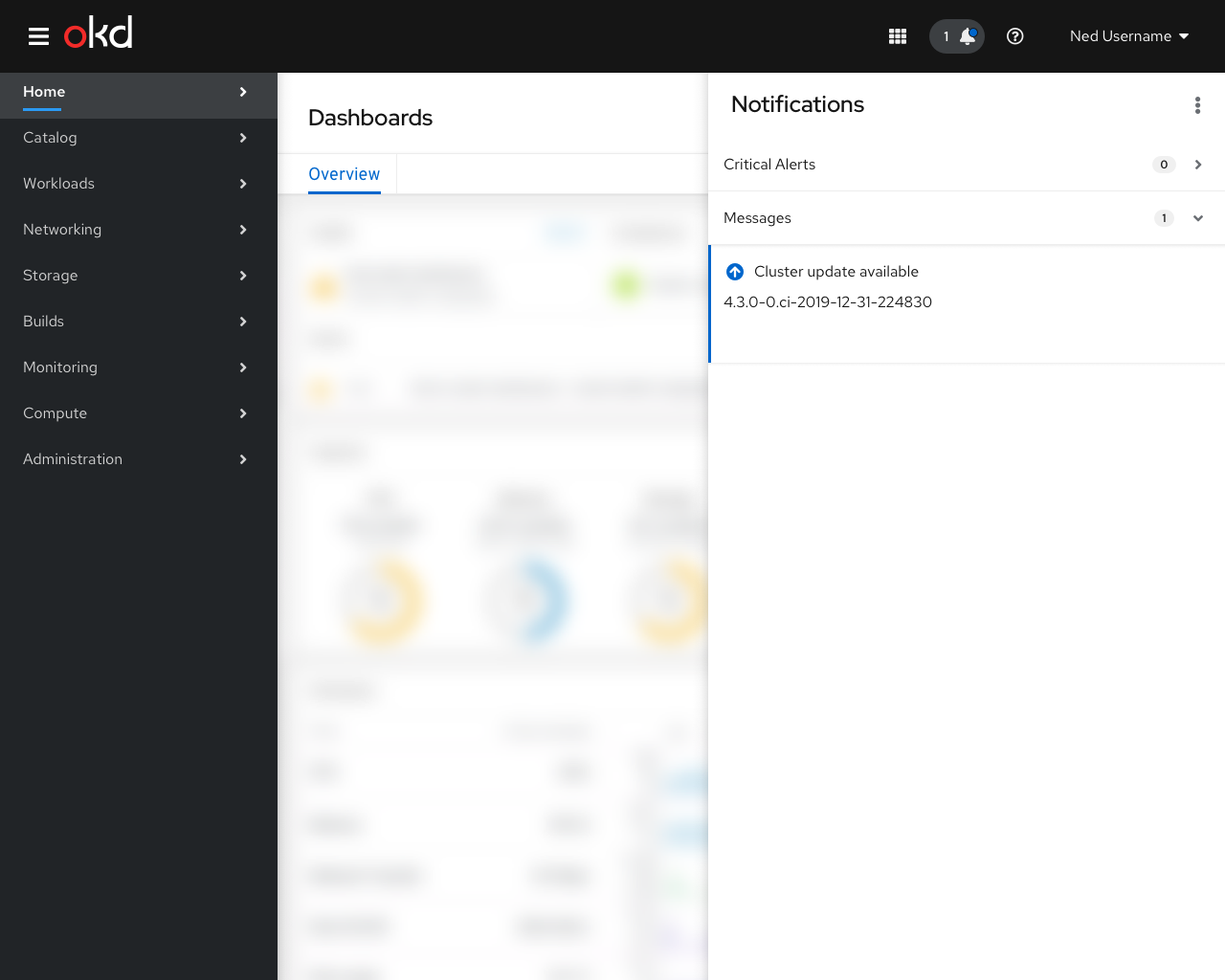
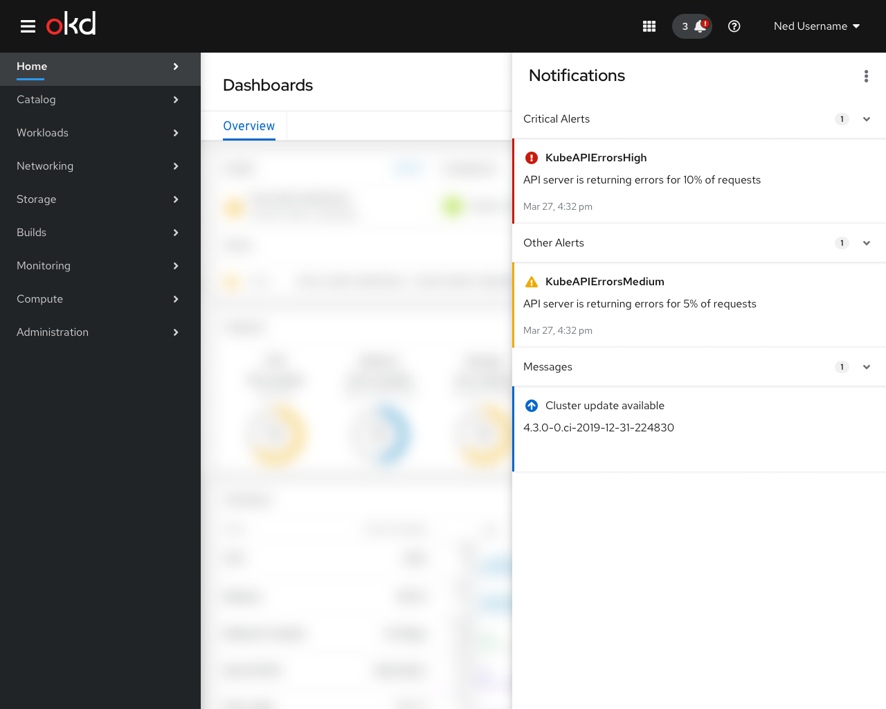
When there are non-critical notifications (such as updates, lower severity alerts, or other messages) a blue dot appears on the icon along with a number representing the number of items in the drawer,
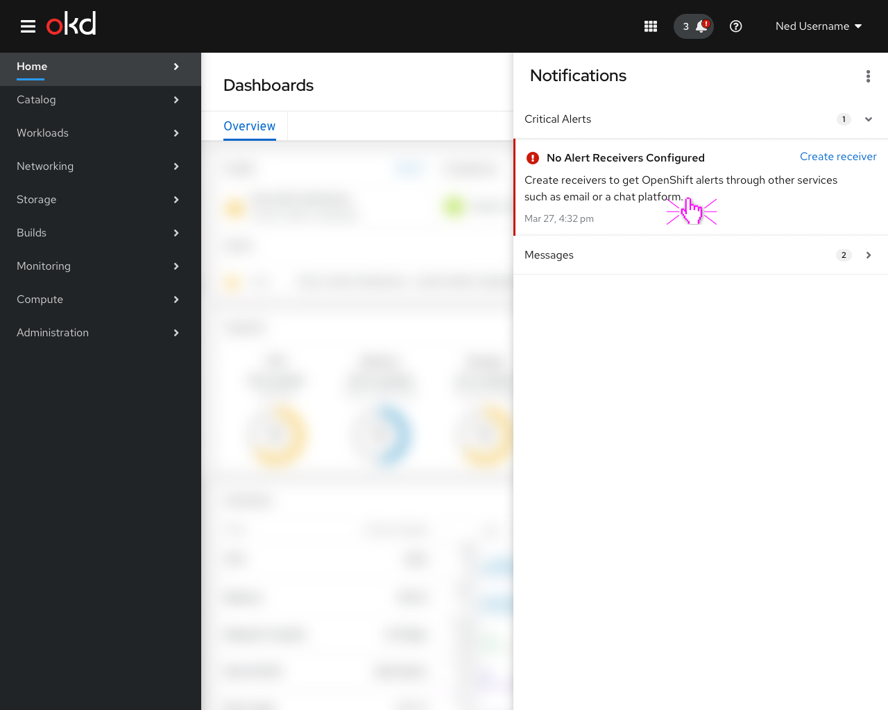
When critical alerts are firing, the icon displays a red (!) icon along with the the total item count.
Alerts
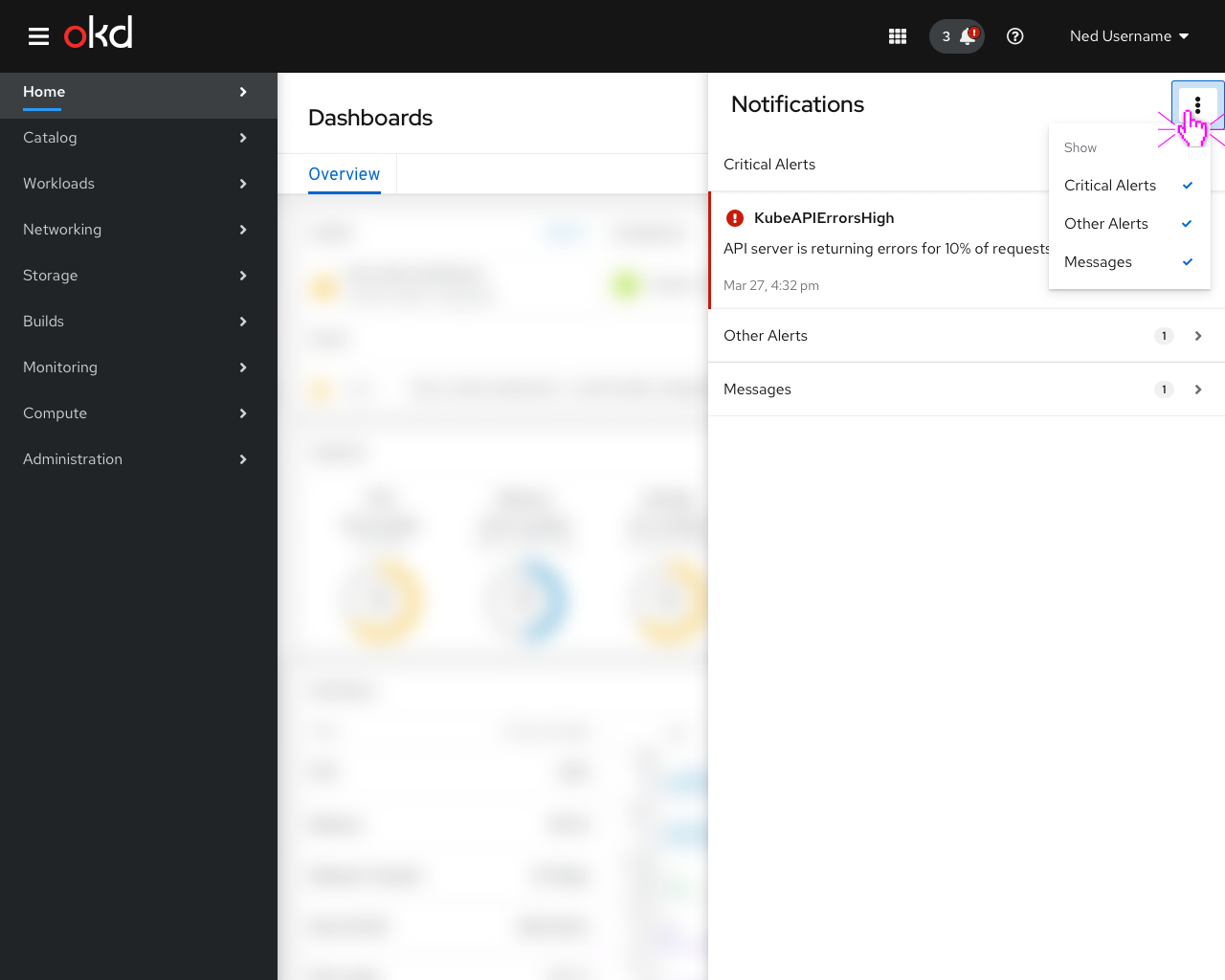
By default, the drawer would contain all types of alerts, but users could choose to omit one or more notification types. These settings would be kept in local browser storage.
Clicking on an alert takes the user to the details page for the alert.
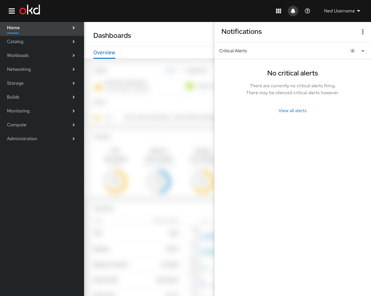
The Critical Alerts group should be expanded by default and all others should be collapsed.
Messages
Non-alert messages, such as updates for the cluster or for specific operators could also be listed here.
Clicking on one of these cards would take the user to a page with information about the updates.
Empty State
When there are no critical alerts firing, the Critical Alerts group should still be present but should contain an empty state pattern.
The Other Alerts, Messages, and any additional categories should be hidden when they are empty.
First Time Setup
Potentially, alerts with a specific annotation could have the annotation rendered as an action or link button. Otherwise, clicking on the alert itself would take the user to the details page for the alert.
A special severity level for “getting started” or “first time setup” alerts could cause them to be rendered in a special way.
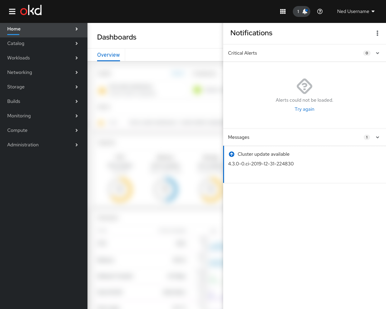
Alert error
In the case of a connection or other error, a message would be displayed with a Try again action to manually refresh.