Label text should match link text color (#0088CE), with a light grey background (#F5F5F5) to differentiate from other links. The grey border around the shape should be a darker grey (#EDEDED).
Label text color will not be matched to the corresponding resource badge color. All label colors will be the same across resource objects
Selectors will remain in various link colors depending on the selector type. These do not have background colors in order to distinguish from labels.
Editing labels will be done in paragraph form, using the equal sign between the key and value. When editing, each label will also have an x to delete individual labels as needed.
Detail Pages
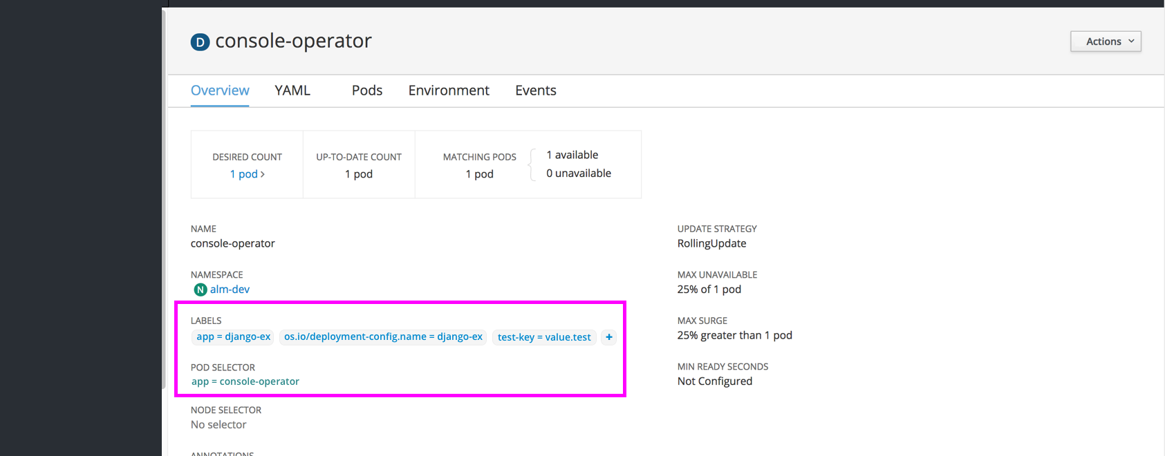
Every resource detail page should include a section for “LABELS” just below name and namespace sections
Clicking a label will jump to a filtered view of the Search Page
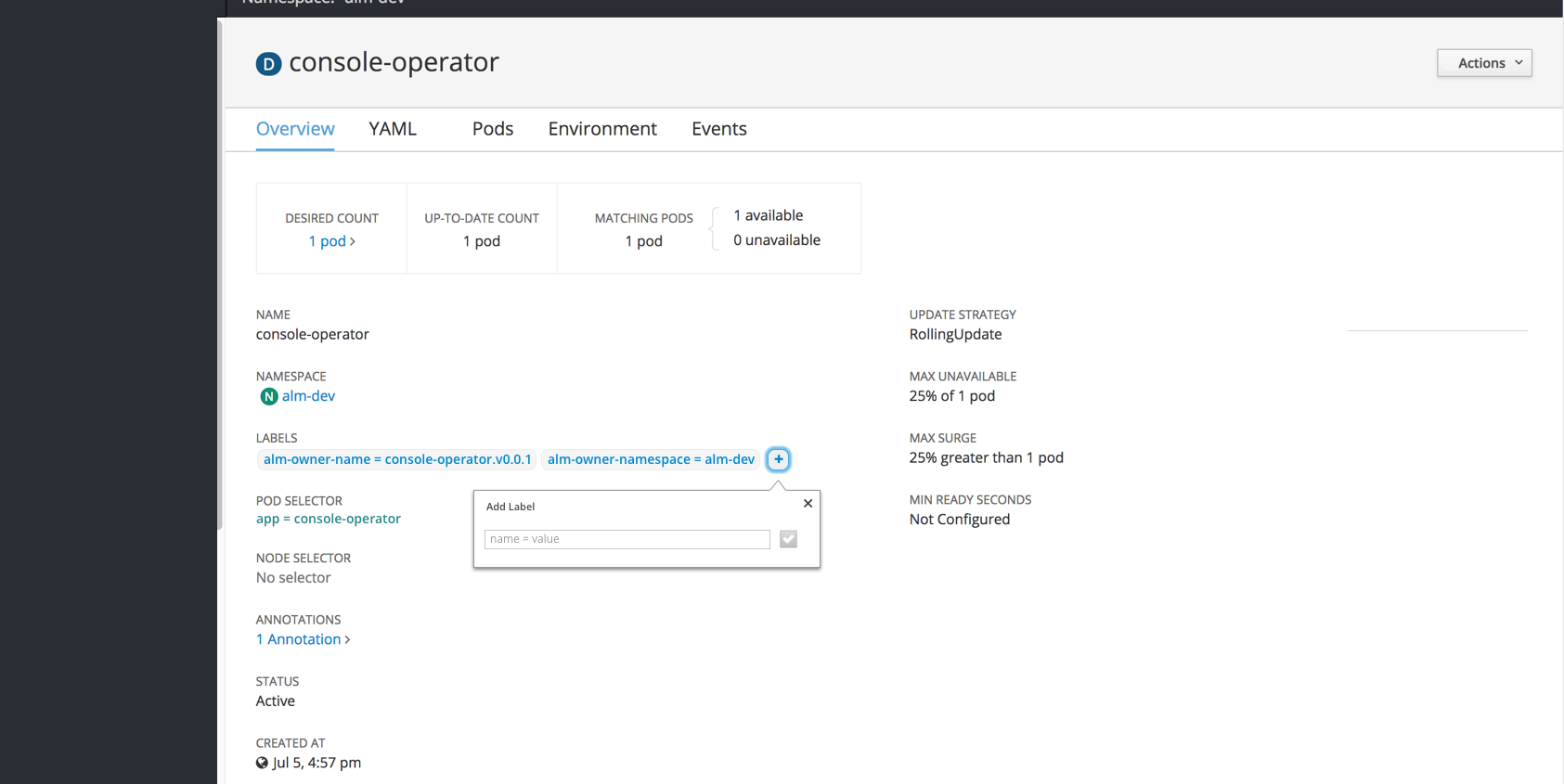
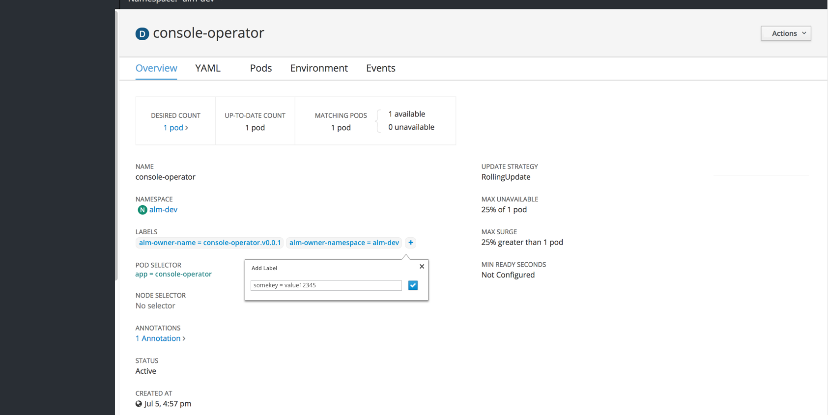
There will be an option for a quick add + button for adding a label with a popover. The save button (checkmark icon) will be disabled until valid text is entered. Saving the label will add the new item to the list in the detail view.
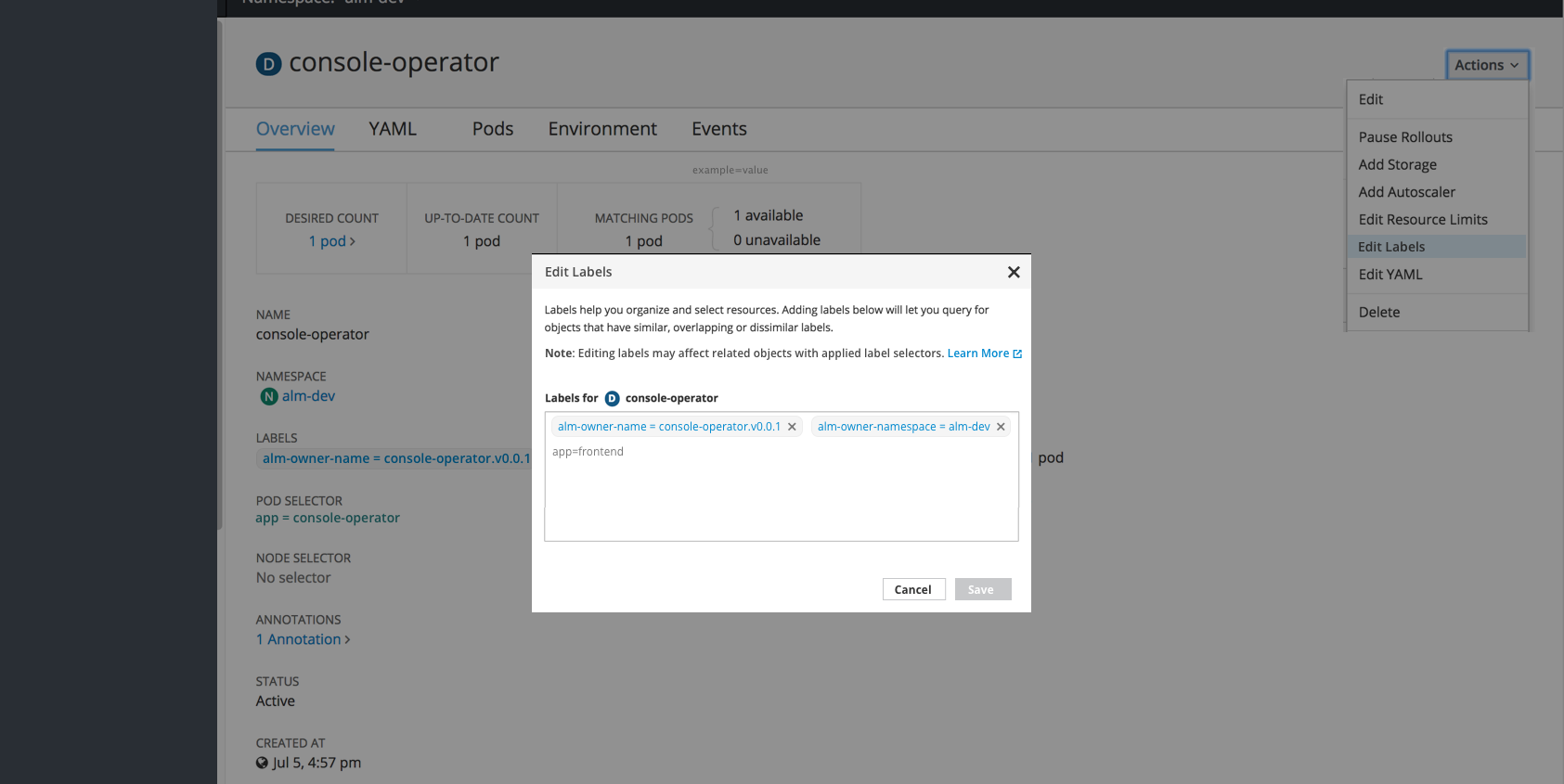
There will be an option to edit labels, visible in the Actions dropdown in the top right
Clicking Edit Labels will open a modal where users can add, remove, and edit labels.
There should be an added line of instructions with a “Learn More” link to documentation on how labels interact with label selectors.
Summary Pages
For now, the labels column should be hidden from the summary pages.
Each row should have kebabs on the right with the “Edit Labels” action present in the dropdown.
Future Considerations
The “Labels” column could be added to summary pages across the board or as needed for specific resource types.
Filtering by label may be added to summary pages to enhance the current filter by name.
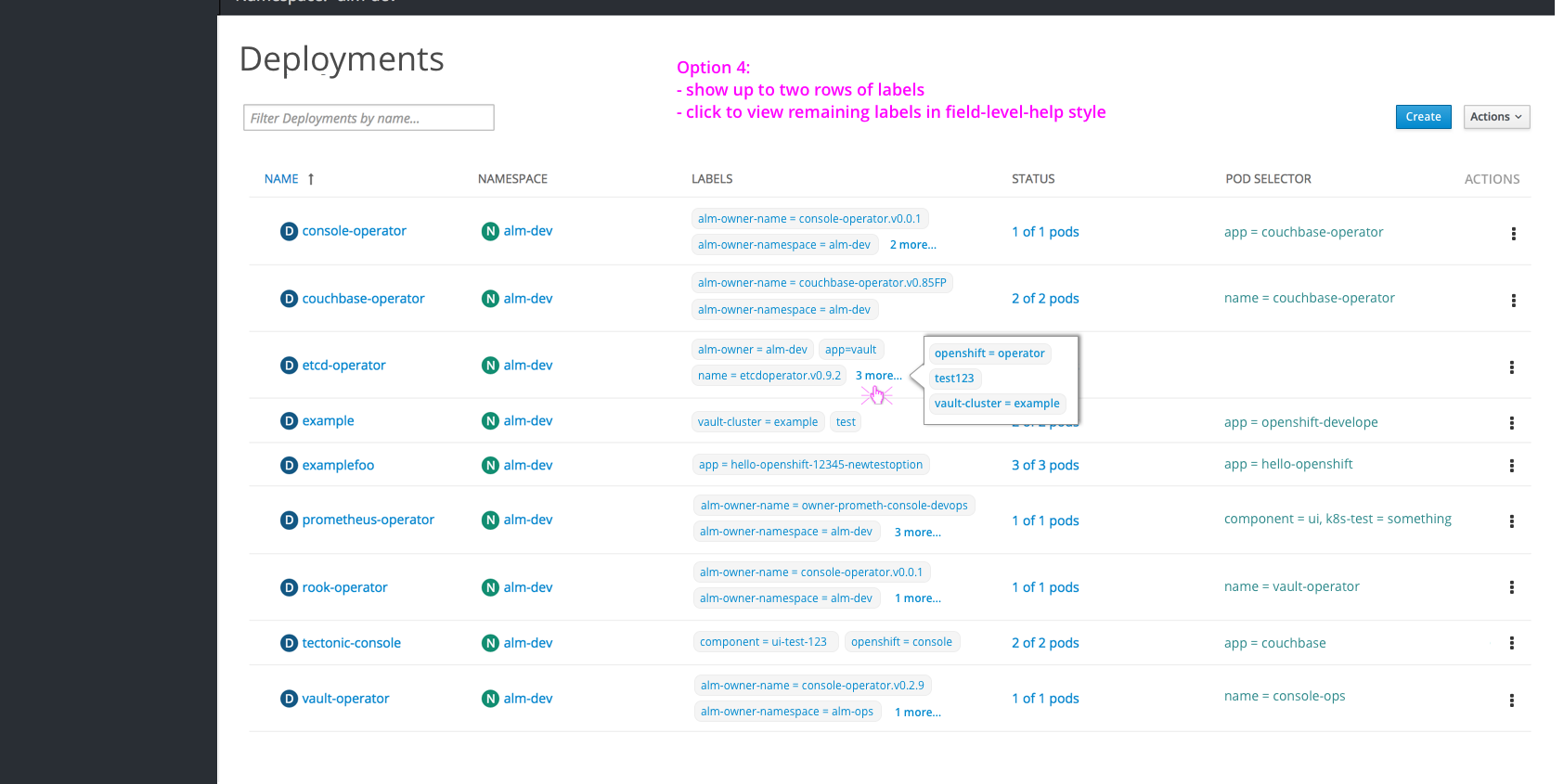
To save vertical space, a max of 2 labels could be shown, with a “more” popover to display the remaining labels for a row.